Fresh Take On French: The Guest Bedrooms
May 30, 2023
Hello, hello, beautiful internet friends! So far, we've shared most of the main spaces from project Fresh Take On French, but today we're diving into some super essential but often overlooked areas: The guest rooms.
This home was truly built for entertaining. All of the main areas were designed to accommodate many guests, and the soon-to-be backyard will be a host/hostesses version of pure paradise. With so much space for entertaining, including rooms for overnight guests was absolutely necessary.
When guests are offered the luxury of their own bedroom, the space should feel precisely that—luxurious. That means providing a comfortable bed to sleep in behind a closed door and designing the room to show that time, effort, and intention went into it. Guests should feel like a priority, not an afterthought.
Ensuite No. 1
The vision for the first guest bedroom was to be more feminine and elegant, while the second guest bedroom was to be its stately and moody counterpart.
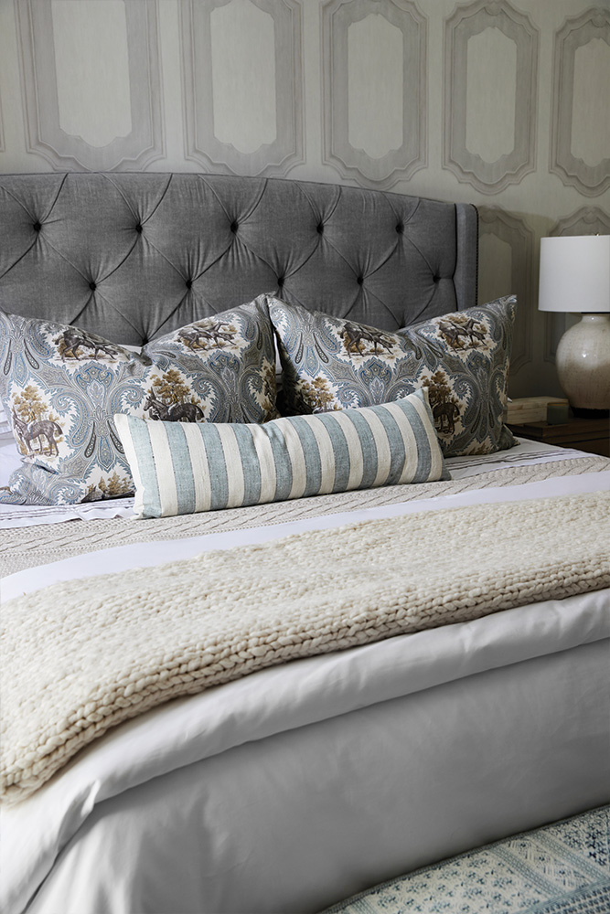
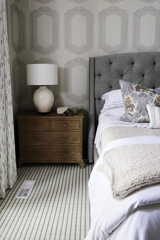
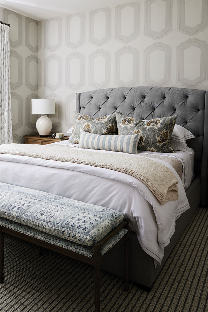
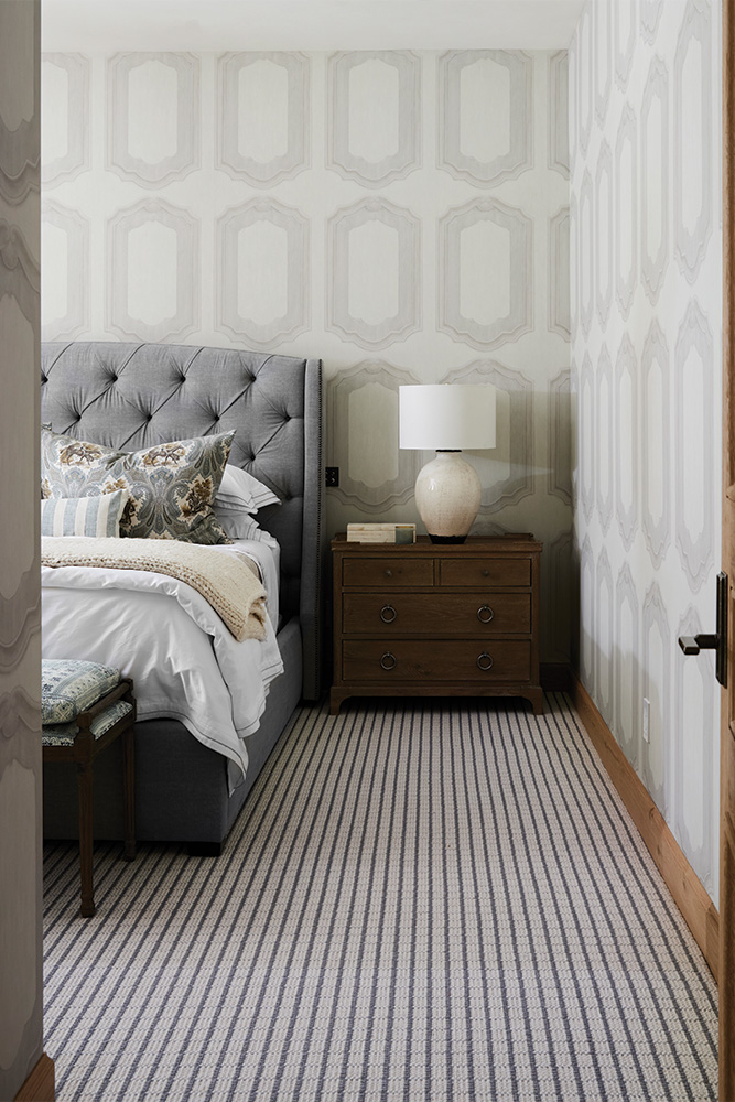
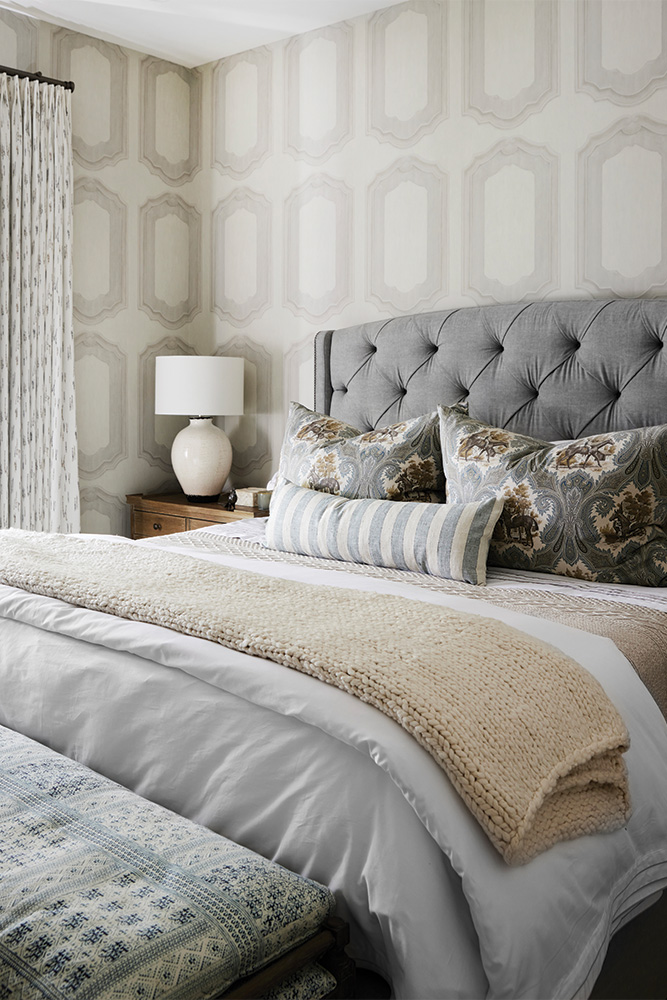
Of course, we incorporated the French design themes running throughout the home into this space. The ivory wallcovering from Cole & Sons is reminiscent of the classic Louis-style wooden paneling, which features in many of Paris's chateaux and stately homes.
We love how much pattern is in this space. From the wallcovering to the drapery, carpets, pillows, and bench, there are so many exciting textiles to explore. Even though this room has lots of pattern on pattern, we kept the color palette super clean and calm so that the space didn't feel too overstimulating.
Ensuite No. 2
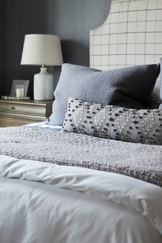
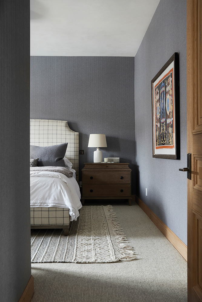
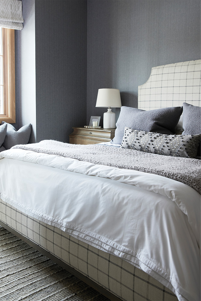
The second bedroom has a nearly identical layout to the first - but a totally different vibe.
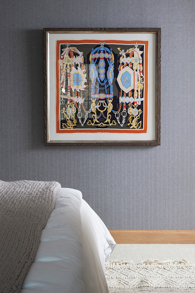
We love the moodier palette of this space and are obsessed with the herringbone linen wallcovering from Holland & Sherry. This subtle menswear textile adds such a stately and sophisticated touch to the space.
For a pop of color, our lovely friend Sam at Bates Art Services sourced this fabulous vintage Hermés scarf which we framed for this space. We love the history, color, and equestrian themes that this piece brings to the room.
The Bathroom
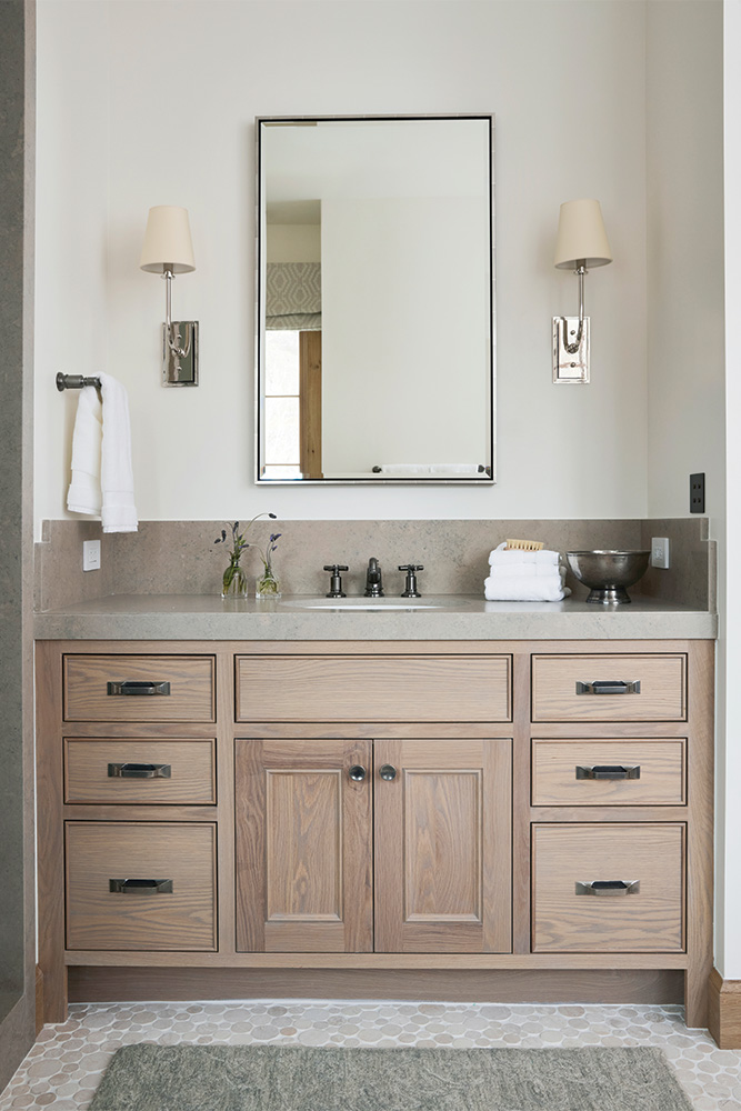
Both guest bedrooms have their own attached bathroom... however, we're only showing you one of the two bathrooms today because one of our vanity mirrors came in damaged! So sad.
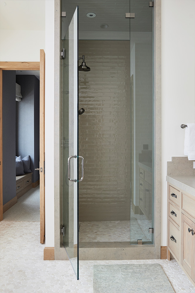
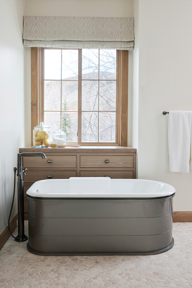
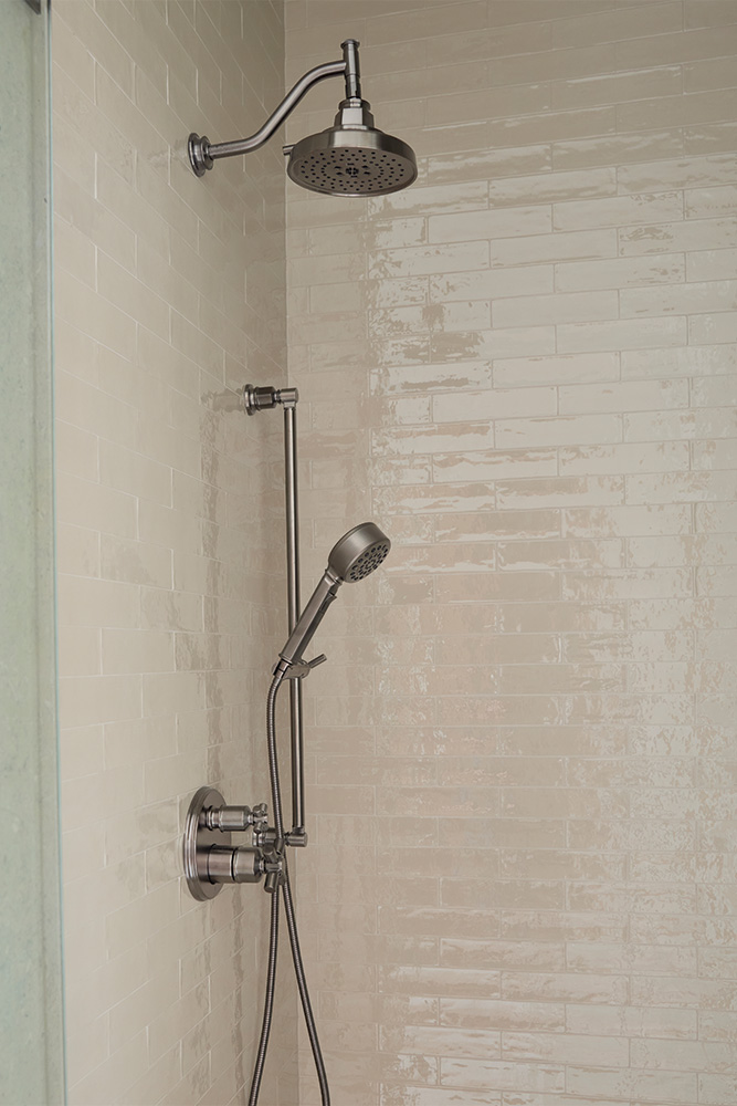
We're pretty obsessed with how this bathroom turned out. It has a simple and understated elegance that makes the space feel super clean yet timeless. The bathroom has some updated takes on classic design selections - like the taupe tile in the shower, which is a more distinctive variation of a traditional white subway tile.
The layout of this room allowed only for a free-standing tub, which we loved but felt like it could be too feminine for the space. We ended up repurposing this Cheviot cast iron tub that we initially specced for a different project but never used. The piece was honestly perfect for this space. It fit the layout and dimensions of the room but also has a more heavy, masculine, and contemporary vibe which we preferred for this particular space.
