Fresh Take On French: The Primary Suite
May 15, 2023
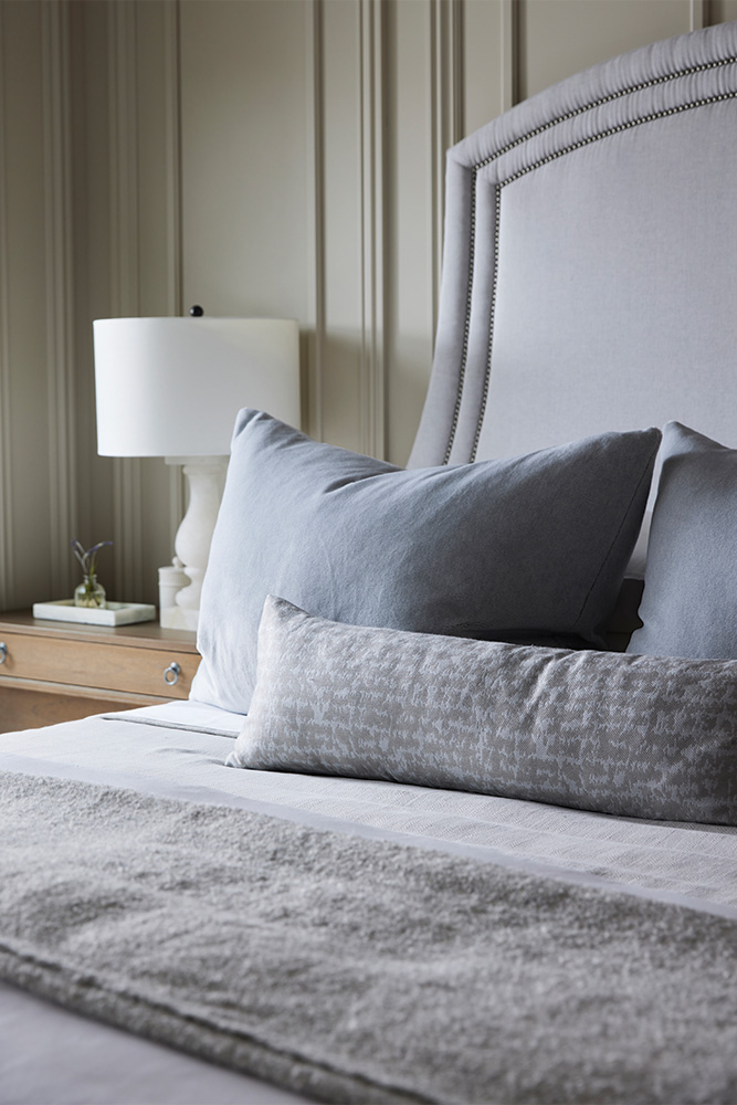
Today we're excited to show you the Fresh Take On French primary bedroom and bathroom and talk about allll the details in these spaces.
You may notice that this primary bedroom isn't a huge space, a conscious decision we made early in the design process.
We believe you don't need tons of square footage to create the primary bedroom of your dreams. This space is supposed to be a restful sanctuary, and having a bedroom that is too large can make the room feel empty and cold. Instead, our clients opted for a cozier bedroom and allocated the extra space to create a sizeable bathroom and luxurious closet.
Historic Millwork + Panelling
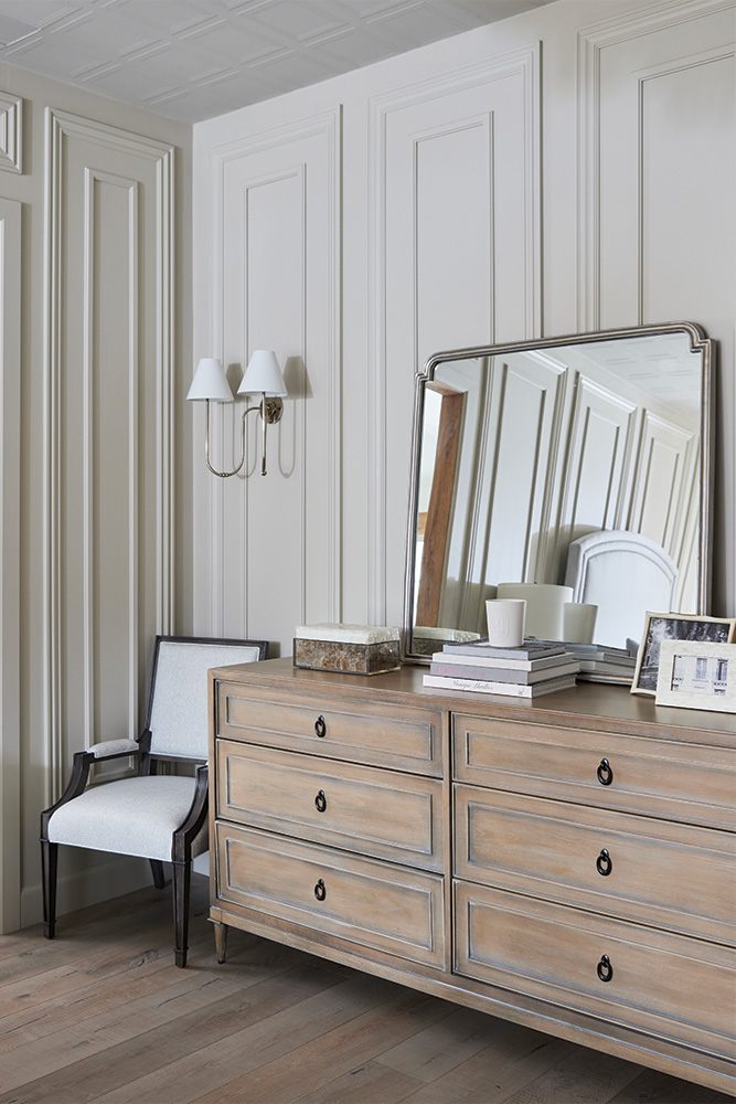
Moldings aren't just a design element; they're a love language. A love language we are well versed in. So you know we've had the time of our life incorporating all kinds of intricate millwork details in this project, and the primary bedroom was no exception.
For a while, we considered wallpaper, but the idea wasn't complimenting the energy of the space. The walls needed to be more refined and elegant, so we decided that custom moldings were the better way to go.
And oh my, it turned out beautifully.
The moldings aren't subtle, but there is a softness and elegance that they bring - which was exactly what we envisioned for the space.
Bare Ceilings Are So Last Season
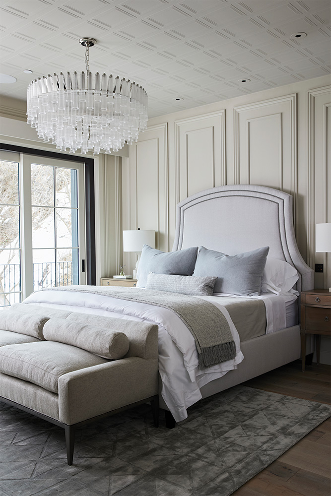
After pouring so much attention into the walls and moldings, the ceiling was practically crying for some love. Compared to the intricate details of the walls, the ceiling felt stark and bare.
We sourced this amazing textured wallpaper that mimics the depth and detail of moldings. Design hack: It's paintable too!
The Bathroom
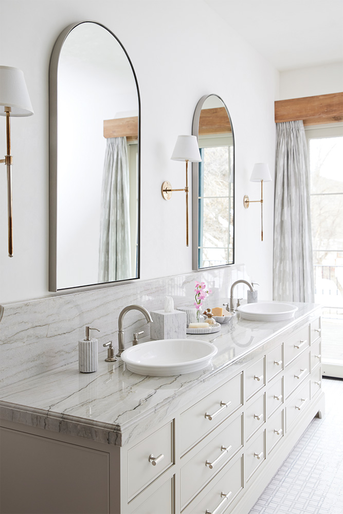
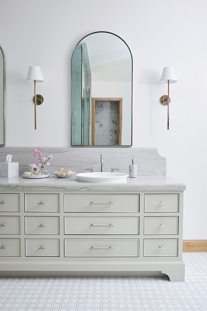
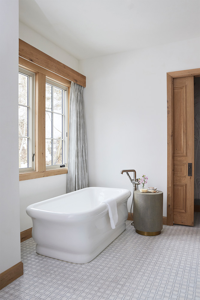
We wanted this bathroom to feel elegant, elevated, bright, and sophisticated. The space has a massive sliding glass door and a large window above the free-standing tub, which lets in so much natural light. The hardware and finishes in this bathroom are mostly a stunning brushed nickel, but we added these beautiful sconces that add some warmth to the space. The heirloom finish is sort of two-toned, which was a thoughtful detail.
Stone Slabs = Art
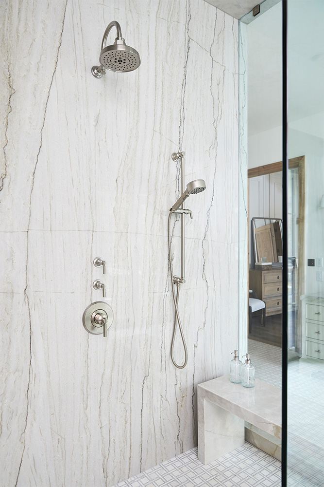
We've said it time and time again, but here we are, saying it again: Mother Nature is THE best designer! So it only made sense to let the shower slab be the star of the show.
This stunning white pearl quartzite slab has the most beautiful gray and gold veining running throughout the stone. This quartzite is light + bright but doesn't feel too cold due to its warm gold undertones. Perfect for anyone who wants a bright bathroom but doesn't want the space to feel too stark or sterile.
The shower bench is custom-fabricated out of the same stone, which is a simple detail that really elevates the space. Two of the four walls of the shower are stone, and the other two are glass - which makes the shower feel super open and luxurious.
2 Comments
The whole project is just so beautiful and serene! Would you mind sharing the source for the doors/trim? Did you do a custom finish on them?
Thanks so much!
Hi Jenni, happy to share what we can! The doors and trim were all custom done by the builders, Magelby Construction. The door style is an 8′ paneled oak with a custom stain. The handles are the “small Olympus lever (LB60)” from Rocky Mountain Hardware. Hope this helps!