The Design Studio: Construction update + Design Boards
July 20, 2022
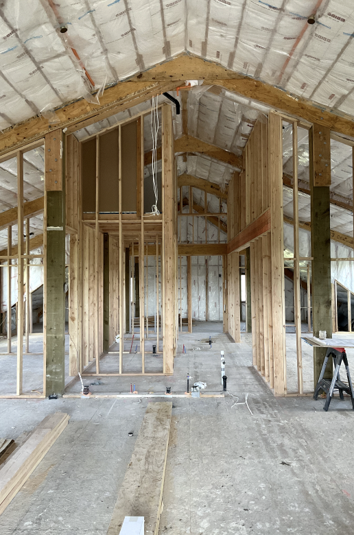
If you follow us on Instagram, you already know that we are in the process of building out our very own design studio! You may not know that our soon-to-be digs will be located above our horse stables. It’s a unique living situation for our business... but we intend to use that to our advantage.
Think “Modern Equestrian” meets “Luxe Penthouse.” See the vision?
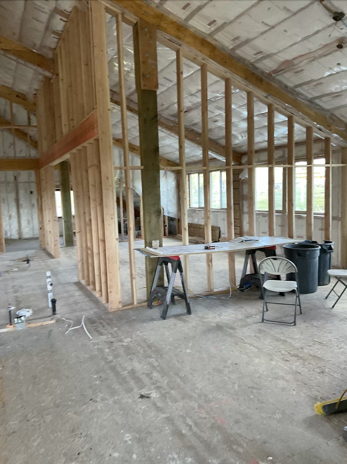
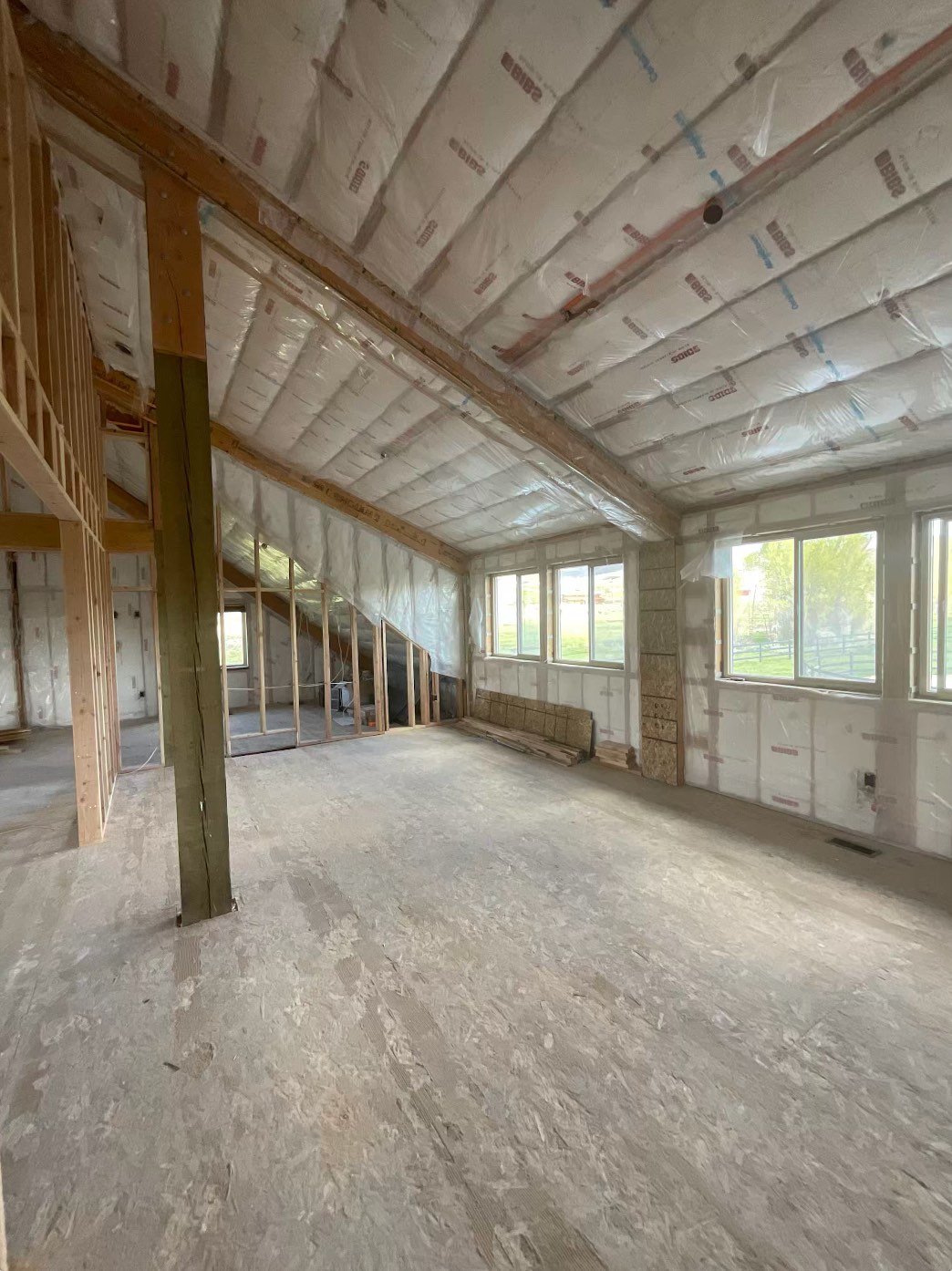
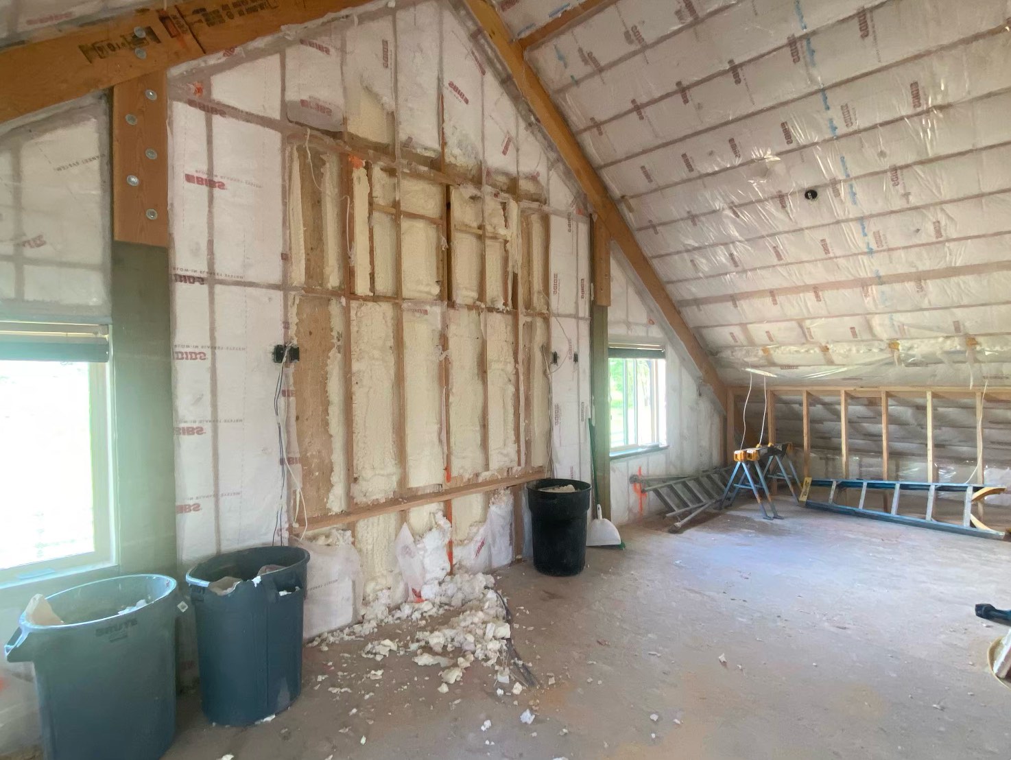
Our studio is on track to be completed in late September. So let’s take a quick tour of our progress and inspiration.
The Exterior
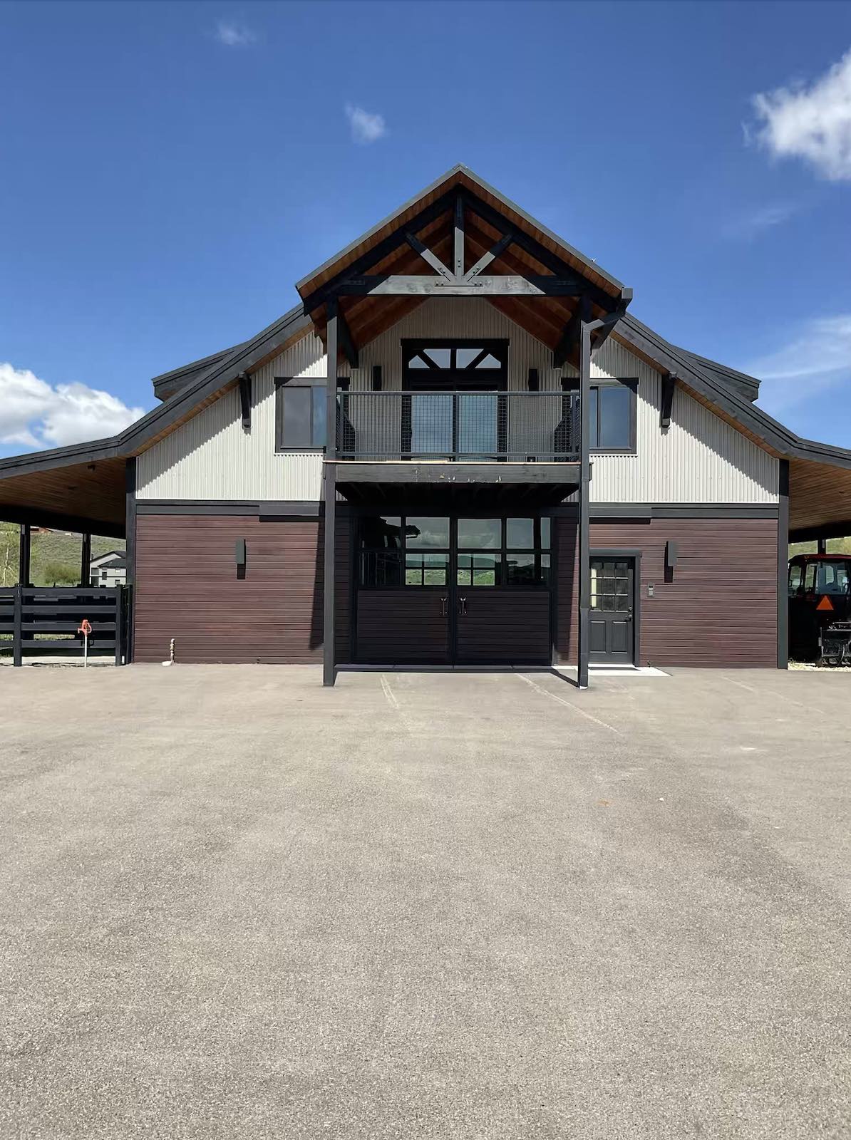
For the exterior, nothing structural is changing. The studio will undergo a significant facelift just by changing the paint color and some other minor details. For the exterior paint color, we selected French Beret from Benjamin Moore, a deep charcoal color that will look seriously moody and luxe. We are pairing this dark color with these fun copper sconces to add some contrast and dimension. Other details like the barn door handles will also be swapped out for something more current... goodbye horseshoe and gemstone duo!
The Entryway
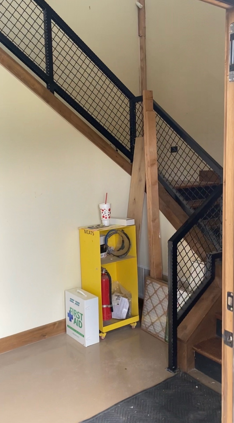
Since the design studio is above the stables, our entryway is actually more of a stairway. Even though visitors will have to go up a flight of stairs before reaching our actual studio, we still wanted this space to feel welcoming and make a beautiful first impression. Upon entering, visitors will be greeted by a cozy sitting area. A black brick tile set in a diagonal basket pattern and a gorgeous glass stair banister will give the space a more modern and fresh feel. We chose this fun horse painting to accessorize the area and to lean into the “modern equestrian” vibe even more. Consider it a special tribute to the honorary Bond team members living in the stables below.
The Lounge & Reception Area
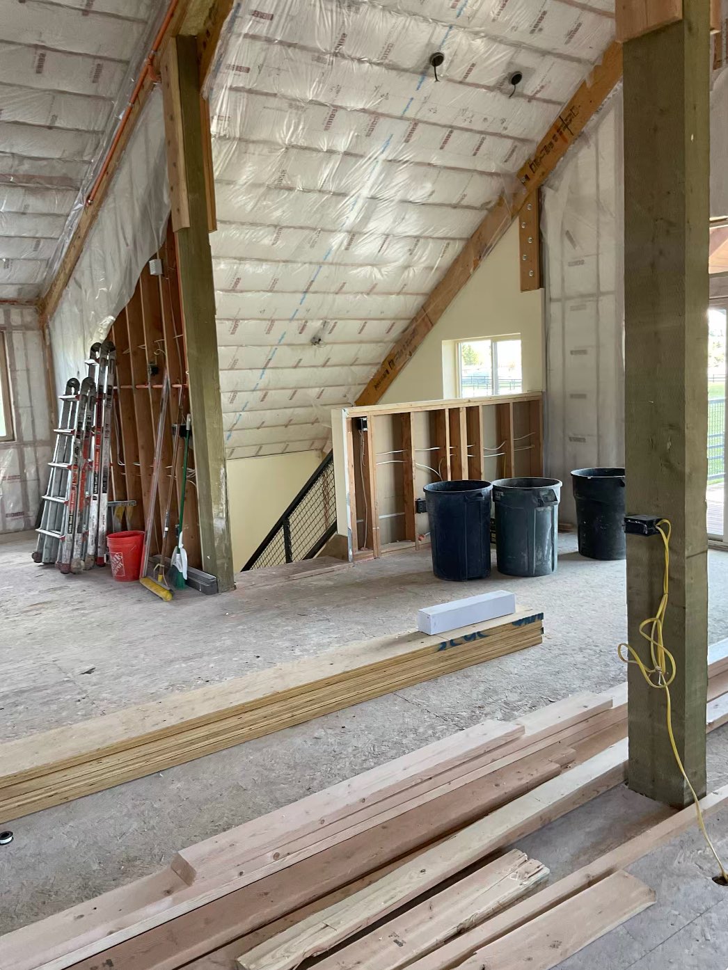
After coming up the stairs and entering the studio space, visitors will be greeted by a comfortable reception area with a sophisticated sensibility. We want this space to feel welcoming while maintaining a level of professionalism. These insanely soft and plush swivel chairs make a super cozy sitting area. We paired these with a gorgeous marble coffee table and a hide-on-hair rug to add even more warmth and texture.
The Kitchen
We are realllllly excited about this kitchen situation. The Calacutta Macchia Vecchia slab that we sourced for this space from Stone Collection is seriously gorgeous. We love it so much that we decided to remove all the kitchen's upper cabinets and use the slab to create a floating stone shelf. The resulting look will be super sleek and modern. For above the stone shelf, we selected these double-arm library sconces.
The Conference Room
Let’s get down to business. The conference room is located towards the front of the studio, just off of the lounge area. Here our team will meet with clients, contractors, and architects for each of our upcoming projects. This space will also be utilized for team meetings, breakout meetings, and every other type of meeting. We love the look of these ultra-sleek Gunnar Pendants. The touch of satin gold on the underside of the shade adds a bit of glam to a relatively modern and masculine-looking space.
The Materials Library
This is where the magic all happens! So much thought went into the design and layout of our materials library because this space not only needs to function efficiently but should be easy to keep organized and navigate while looking beautiful too! Our materials library is separated into two areas by an extra bookshelf. This layout not only creates additional storage for our forever-growing sample collection but also allows multiple designers to use the space privately at once.
The Design Center
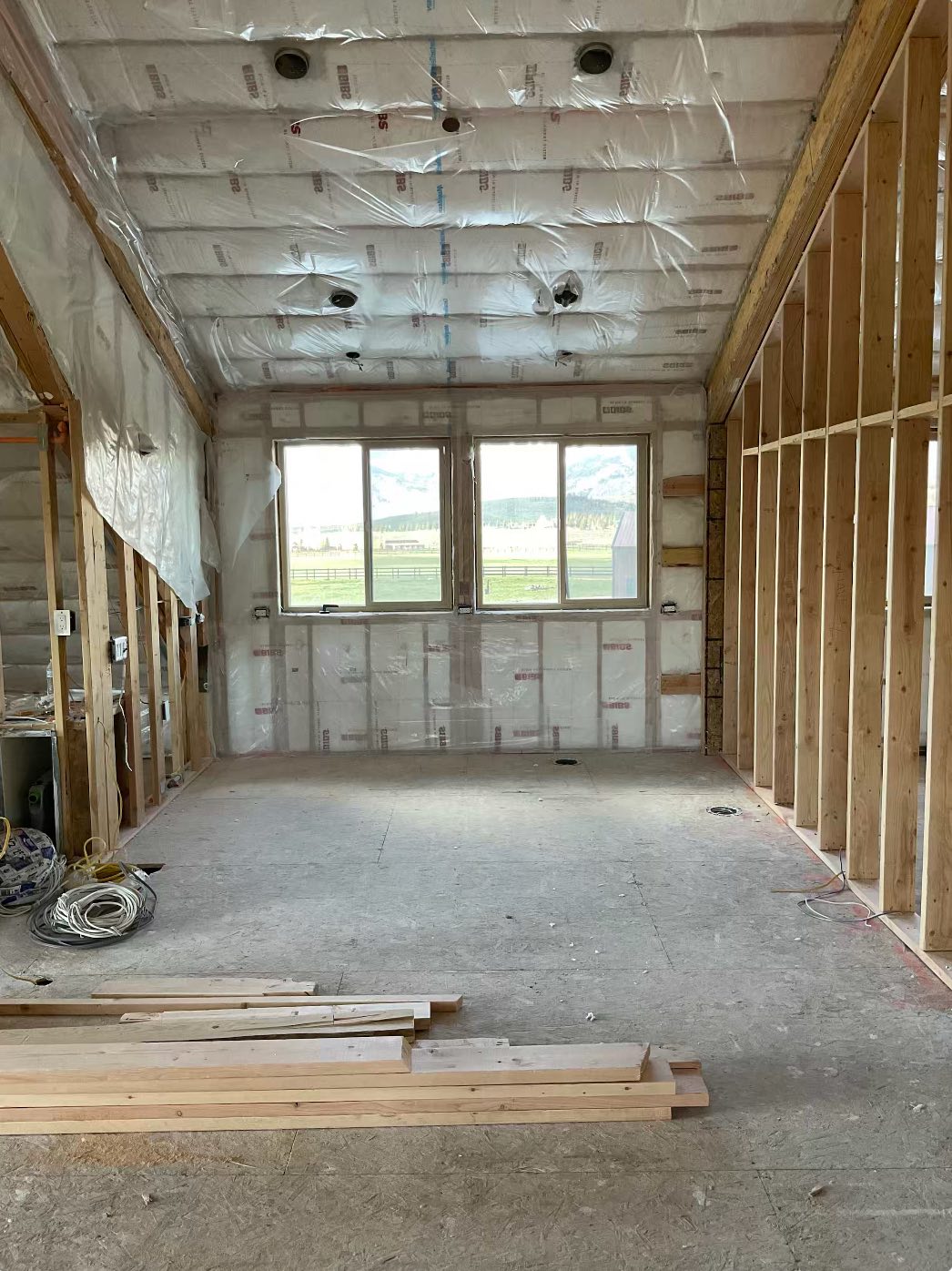
When planning the layout of the studio, our team knew that we needed both areas for individual work as well as ones for collaboration. Instead of doing individual offices for each designer, we opted for one open office space. We want the design center to facilitate teamwork and creative thinking between our designers. Additionally, designers can retreat to separate breakout areas throughout the office for heads-down work.
The Watercloset
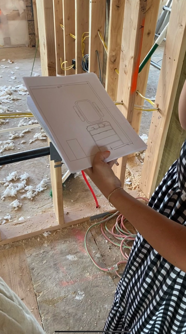
Just because it is an office bathroom doesn’t mean it has to look like an office bathroom. When you work as an interior designer, no room get’s left behind or forgotten. Bathrooms are no exception. We always get excited to design a powder bathroom because they are such great rooms to take design risks! A bold wallpaper or geometric tile goes a long way in these small spaces; in our case, we decided to use both.
