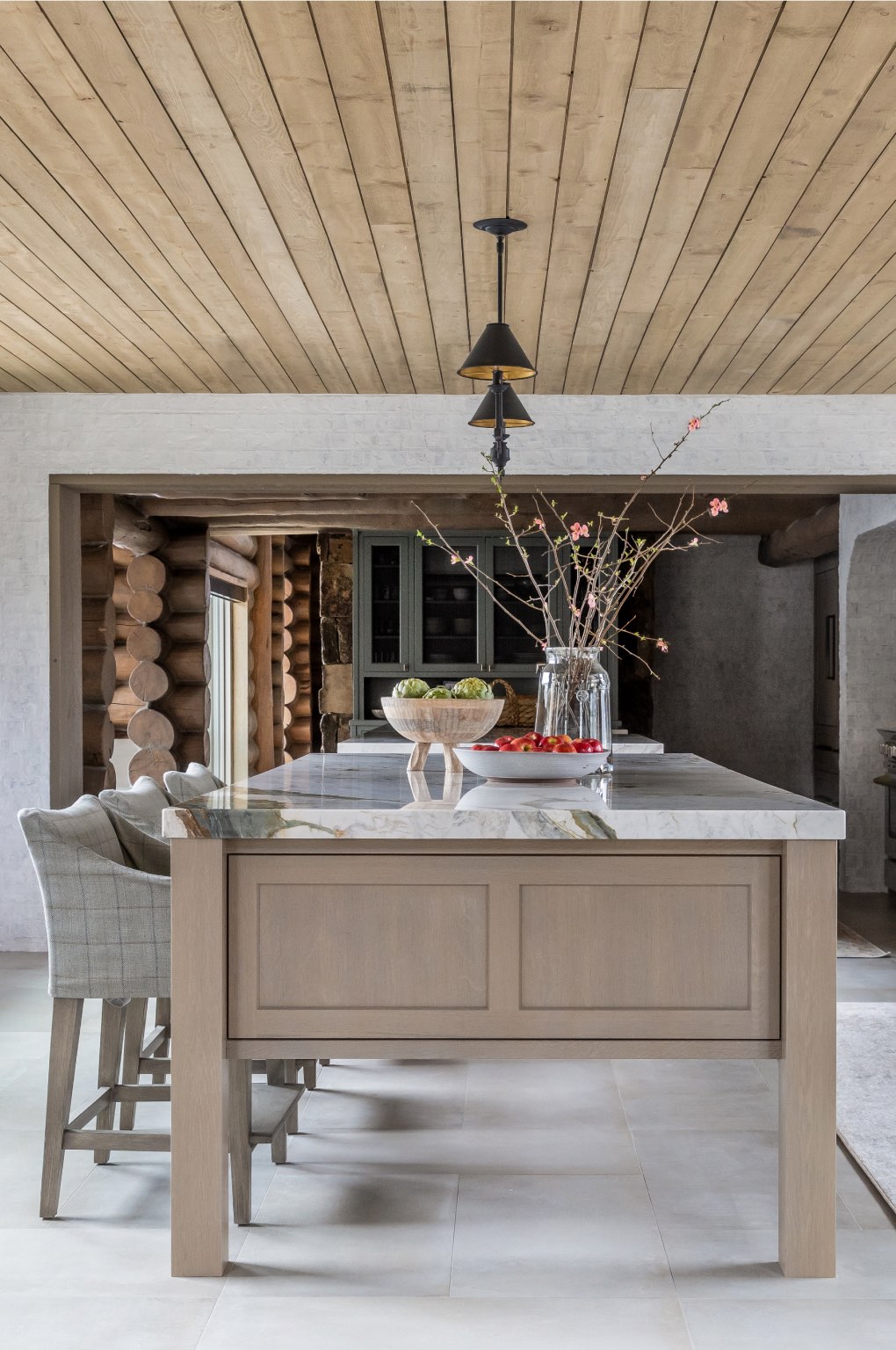
Into The Woods: The Kitchen
July 18, 2022
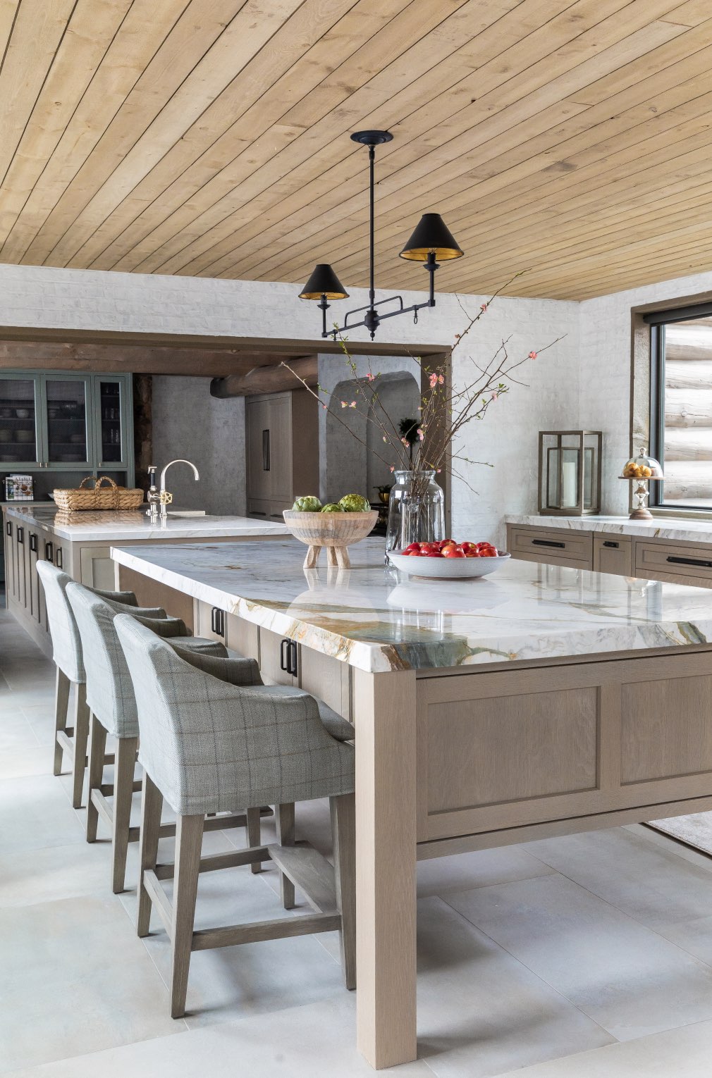
This entire project was truly a labor of love and passion, and the kitchen was no exception! The kitchen acts as the conjunction where the original cabin meets the new parts of the home, so we had to plan carefully to ensure everything flowed together really well. A unique layout, innovative design solutions, and a combination of different design styles make this kitchen one of our favorite design endeavors to date!
Two Is Better Than One
The first highlight of this space is the two insanely massive kitchen islands. The islands create a visual and functional divide in such a long, narrow kitchen space. The first island provides extra storage and seating, while the second is more functional and hosts the kitchen sink, two built-in dishwashers, and a butcherblock counter-end. Since this kitchen has no upper cabinets, we maximized storage space in each kitchen island. There are additional cabinets under the bar space in the first island and on the back side of the second island.
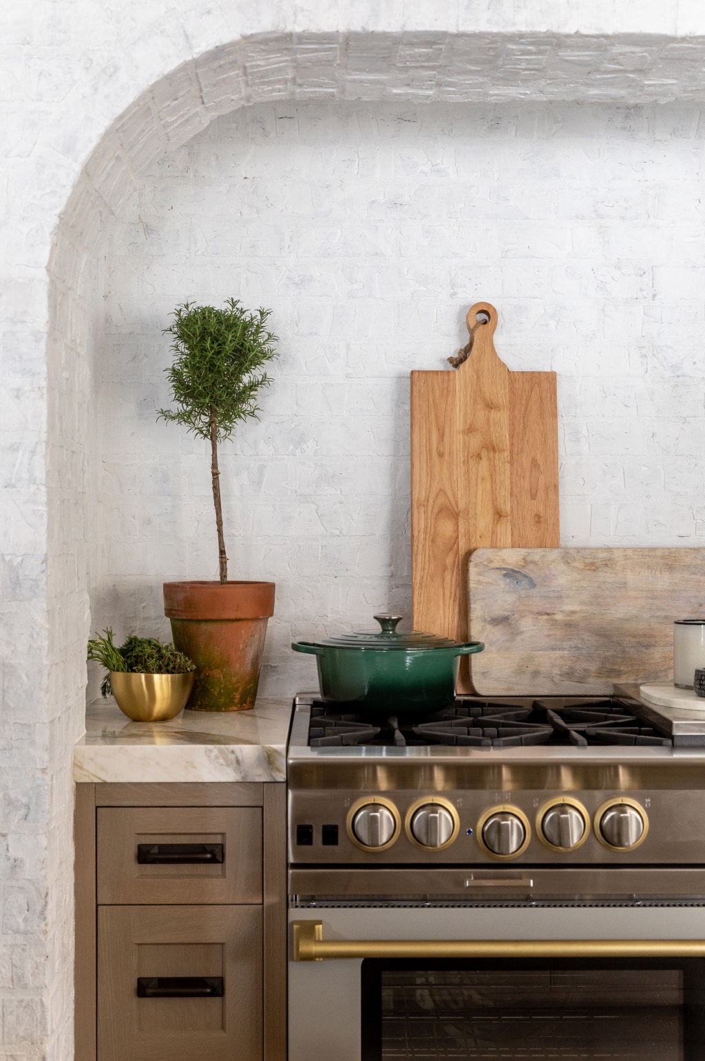
All About The Range
Okay... This custom range and the white-wash brick combo are everything! For some reason, it’s giving ‘Italian Cottage’ vibes? Just us?
Whatever you want to call it, it’s one of the highlights of this kitchen. We incorporated the white brick to help brighten up the warm, rustic style of the home, while this custom Blue Star range added a more modern and industrial vibe to the space.
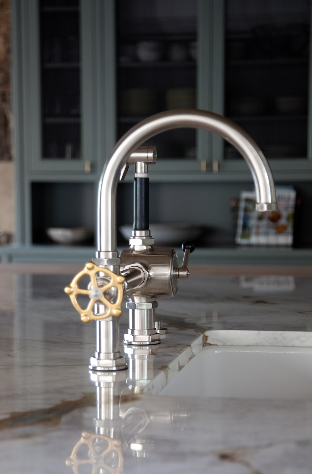
Industrial Details
Since this log cabin is so rustic, we thought it was essential to incorporate some industrial finishes and details to keep the design fresh. When we saw this Waterworks Regulator Gooseneck Kitchen Faucet, we immediately fell in love with it and knew it would be the perfect piece for this project! The faucet’s design was inspired by the “industrial controls from the early 1900s,” giving the space a rugged beauty. The piece is masculine, fresh, industrial, and functional in all the best ways.

Structural Style
This log cabin kitchen presented itself with some unique architectural challenges. For example, a few of the larger wood beams in this space were structural... meaning they had to stay to support the ceiling from collapsing. Important? Absolutely. Convenient? Mmmmm.... not so much.
The lower height of these structural beams affected the type of fridge we could put into the space. We had to order this one from GERMANY because it was the only one with the correct dimensions for the area. But hey, if there is a will, there is a way.
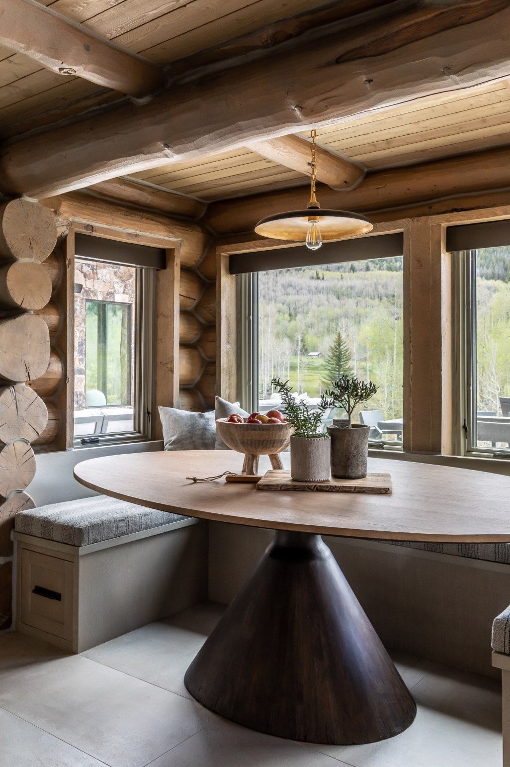
A Cozy Lil' Breakfast Nook
Obsessed might be an understatement when it comes to this breakfast nook. The oval dining table brought a fresh and modern perspective to this rustic spot, while the pendent light brought a bit of glam with a touch of brass. The bench seating doubles as extra storage with the large drawers that pull out from under each of the bench ends. Overall, we would say that this nook ended up being one of our favorite spots in the home. It’s cozy, intimate, and fresh.
Credits
Photo: Lindsay Salazar Photography
Construction: Magleby Construction
Design: Jennifer Chipman
*This project was designed by Jennifer prior to creating Bond Design Company
3 Comments
Hello-
I love your design aesthetic! Do you mind telling me what color/knob and handle options you chose for the Blue Star range in the Into the Woods blog post?
Many thanks,
Kristine
The knobs and handles are the brushed brass option from Blue Star’s website!
Can I please get the source for the cabinet hardware? I NEED this on my life