All The Paint Colors In Our Design Studio
September 28, 2022
If you've been following us on Instagram, then you know about all the exciting progress happening at our new design studio! If you haven't been following along, then make sure to check out the project in our story highlights!
This week we've finalized our paint color selections! And may we just say, that they are going to look soooo pretty! We only had to choose three paint colors, because the majority of our office will have wallpaper, so we spent a lot of time looking for the perfect options.
Here's what we picked:
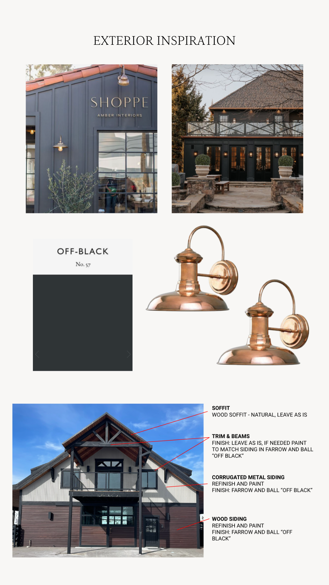
Exterior Color: Off-Black by Farrow & Ball
Since the beginning of the renovation, we just knew that this building just needed to have a moodier vibe. So a charcoal color with copper sconces as an accent has always been on our vision board for the studio exterior. Off-Black by Farrow & Ball is a soft black that is much more flattering adjacent to other colors than a true black hue would be, which works great for our copper accents. It has a much milder hue but slightly cool undertones, which we preferred over any warm undertones.

Design: Hedgewood Homes
Photography: Hedgewood Homes
Design: KLH Custom Homes
Photography: The Mittentog
Design: MADE LLC
Photograph via: Farrow & Ball

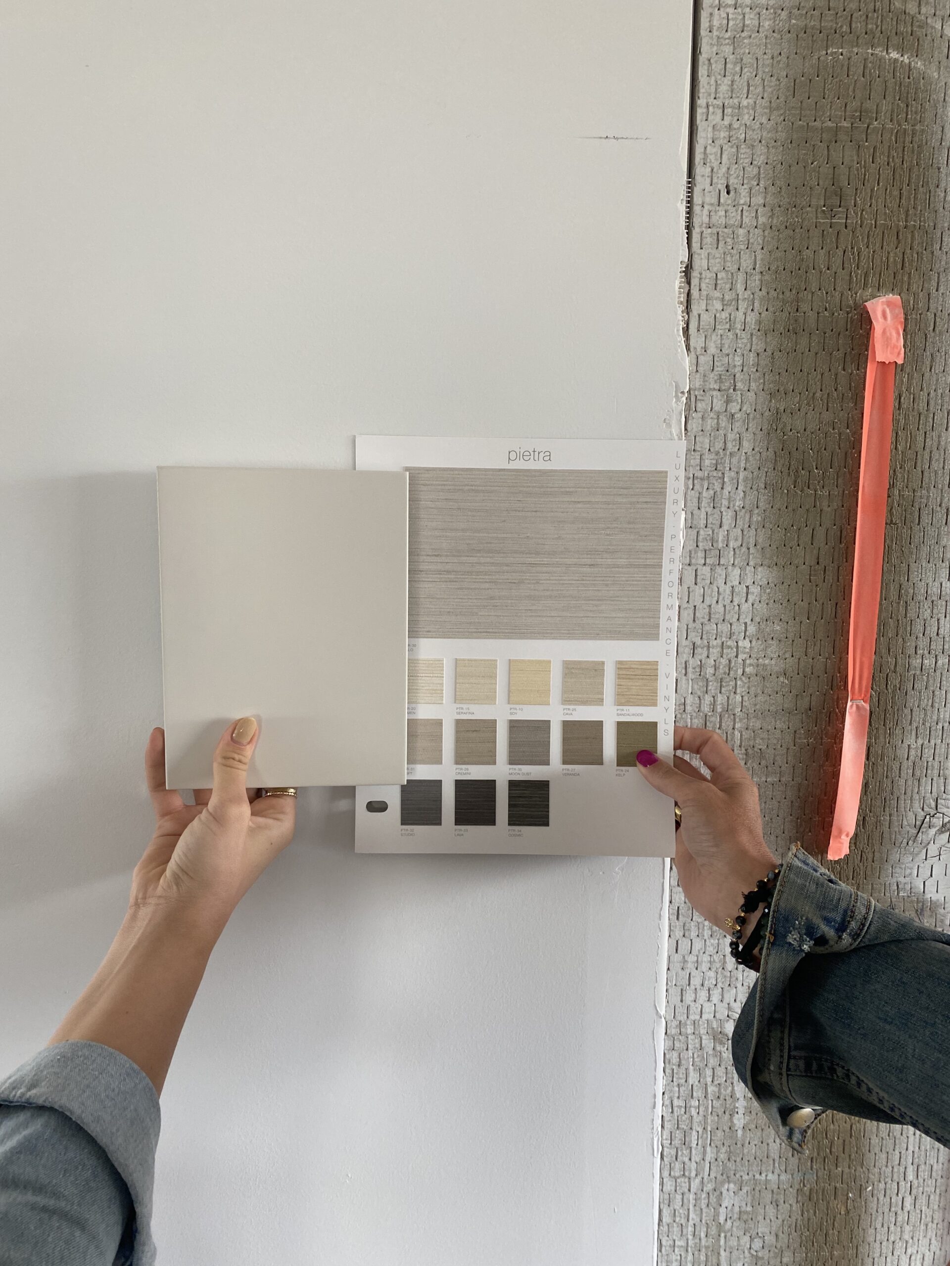
Interior Walls, Ceilings, & Millwork: Bruton White by Benjamin Moore
For years, our go-to interior paint colors were Swiss Coffee by Benjamin Moore and Natural Choice by Sherwin Williams... But we've had a change of heart.
Bruton White is our new #1.
It might be called white, but it’s actually soft gray with black undertones. A neutral greige, if you will. That's why the color is so versatile and pairs well with our Onyx window casings. The bespoke tone is great for millwork, like kitchen cabinets and doors... but we've opted to use it for all of our walls, ceilings, and paneling here.
If you're looking for the perfect neutral wall color, definitely check this one out.
Design: Moore House Design
Photography: Erin McGinn & Zack Dezon
Design: Anthony D'Argenzio
Photography: Zio and Sons
Design: Unknown
Photography: Benjamin Moore
Bathroom Paneling: Goodwin Green by Benjamin Moore
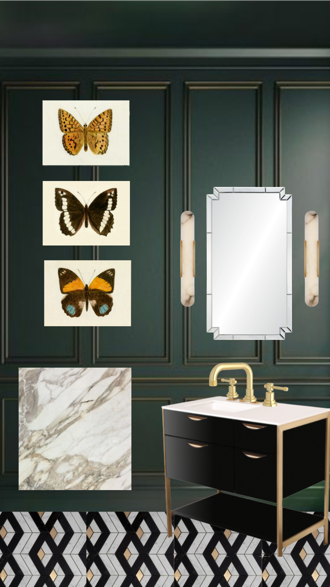
We wanted to do something bold in our powder bathroom. Initially, we thought about using a fun wallpaper but were unable to find something that we really loved for this space. So we switched gears completely and decided to go with a moody paint color and some beautiful millwork.
Goodwin Green was perfect for this. This rich and intense shade of deep green makes a bold statement all on its own and feels exceptionally luxurious when paired with gold metal finishes.
Here is our current design mock-up for the bathroom:

Design: One Kings Lane
Photography: David A. Land
Design: deVOL
Photography: deVOL
Design: Nicola Miller
Photography: Chris Snook
If you're looking for any more paint color recommendations, then be sure to check out our "Our Favorite Paint Colors" blog post. Thanks for tuning in! See ya soon!