Paint Colors We’re Loving Right Now
April 24, 2024
Progress is happening quickly at our Fifth Avenue Ranch project, and we're about ready to start painting! This home will be filled with intricate moldings, bold colors, and playful patterns, so we paid special attention to selecting paint colors that can either support those design details or add to the "quirkiness" of certain spaces.
When selecting paint colors for a home, we love to use Samplize peel-and-stick paint swatches. Their large samples are so much better than trying to use the itty-bitty teeny-tiny swatches in a traditional paint deck.
Click on any of the photos or links below to buy your own samples of these classic faves.
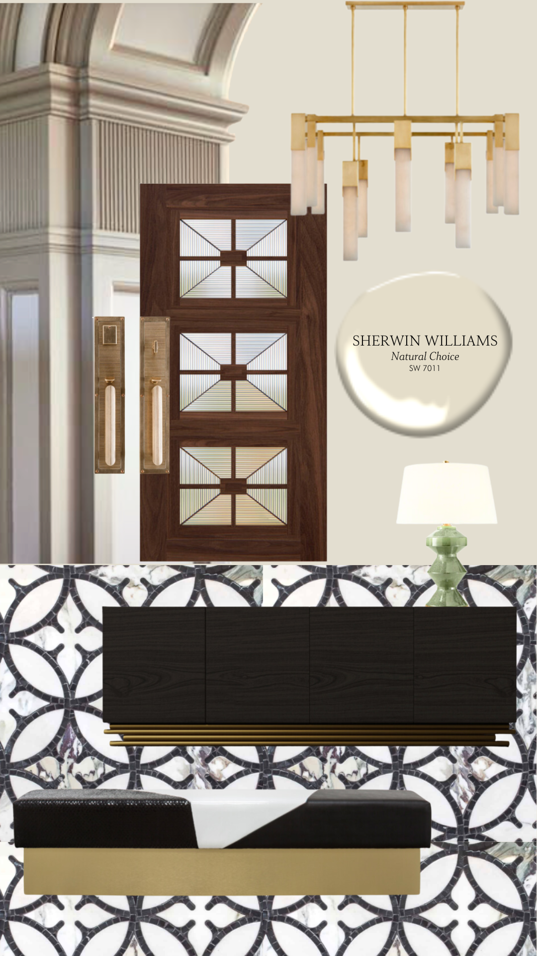
Meet The Hero Color
A "hero" paint color is the paint used throughout the majority of your home. Think ceilings, trim, hallways, doors, etc. It is typically a soft white or beige.
For this project, our hero color will be used mainly in the open-concept areas of the home (entry, great room, kitchen, hallways... you get the gist). We selected Sherwin Williams—Natural Choice, which shouldn't surprise anyone because this has been one of our go-to white paint colors for YEARS! This color is creamy yet cool, so it feels clean and welcoming without being too stark or white.
These spaces feature intricate molding and playful tile patterns, so we wanted a color that wouldn't distract from but enhance those beautiful design details. A lot is going on in this home, so we saved the more powerful colors for some smaller spaces that we want to make a unique statement with.
The Mudroom
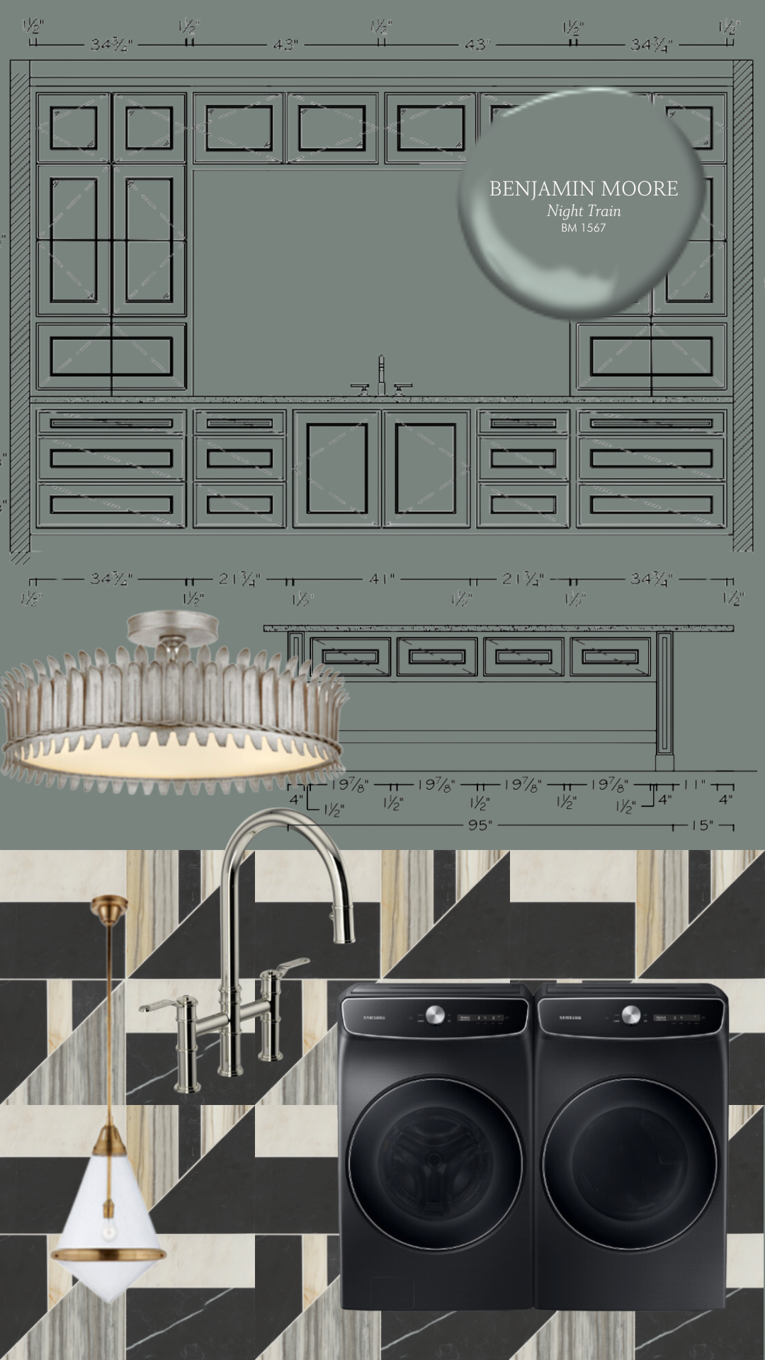
To say we're excited about this mudroom might be an understatement because this may be the fanciest laundry room we've EVER designed!
This open-concept space has wall-to-wall cabinetry and an island in the center of the room. Since there is a ton of cabinetry going in this space, we knew we wanted to make a bold statement and select a fun color.
Benjamin Moore—Night Train felt like the perfect pick. This dark gray is infused with cool green undertones and has an air of glamour about it, which we felt paired perfectly with the honed marble mosaic tile.
The Primary Bathroom
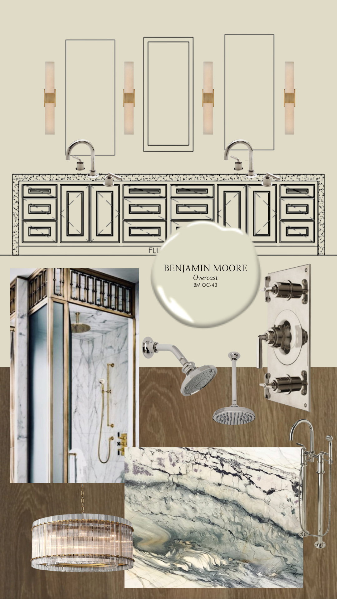
The design for this primary bathroom is centered on one thing, and one thing only: this Calacatta Turquoise marble slab. We are using this stunner on EVERYTHING, from the shower walls to the under-mount bathtub with marble cladding and the vanity counters—we want this marble to be the center of attention.
When selecting a cabinet paint color, we matched the creamy colors running through the slab.
Benjamin Moore—Overcast was the perfect match. This calming off-white has subdued green undertones that beautifully complement the verdant marble.
The Home Office
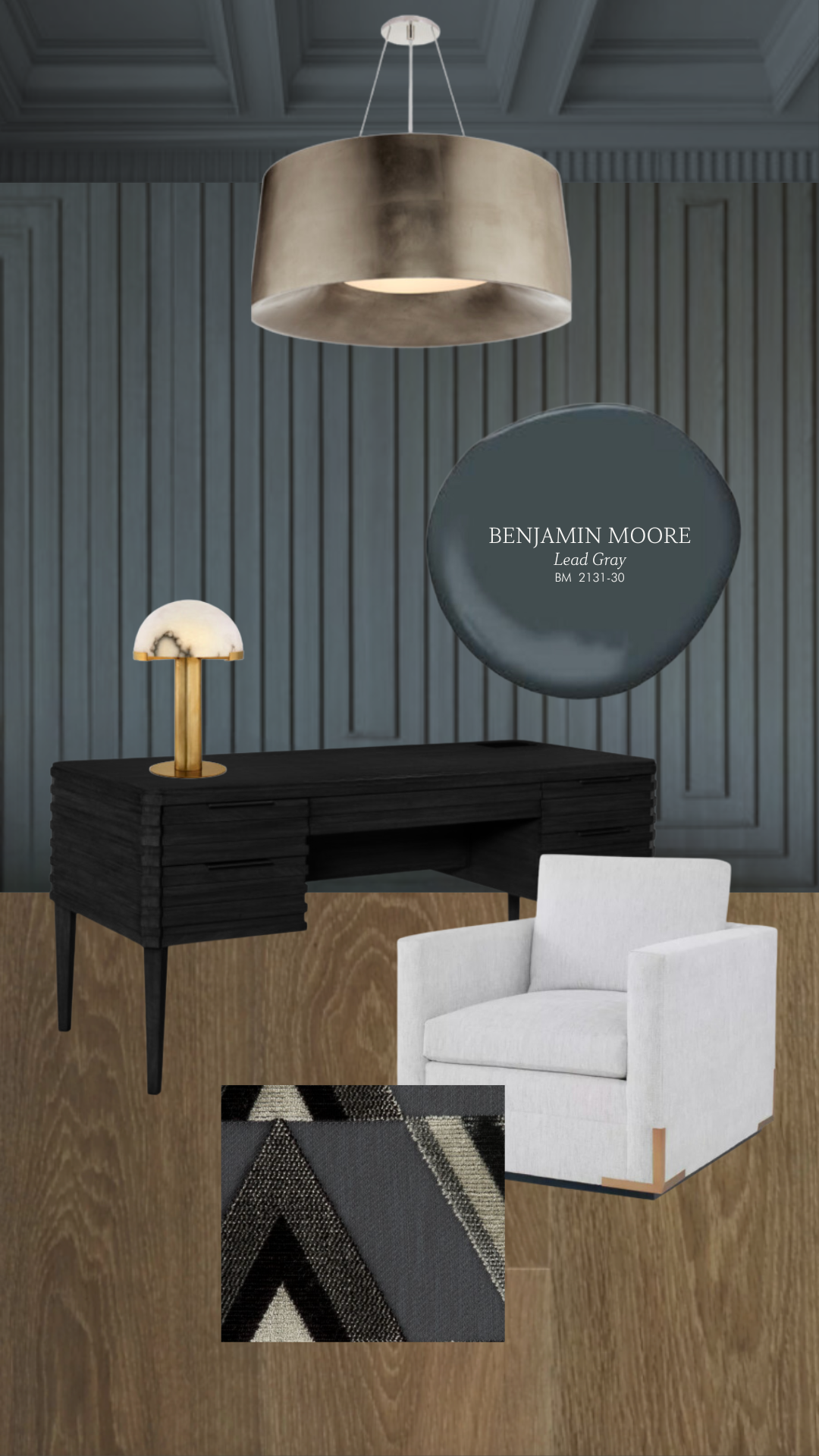
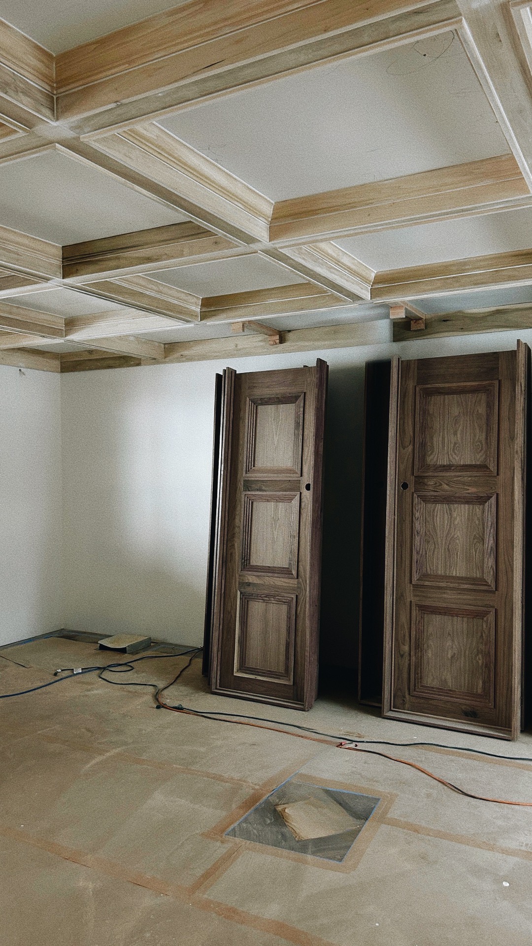
This sophisticated home office is another space with lots of cabinetry, wall paneling, and intricate ceiling moldings. We went all out on the bold and moody energy of the space.
This nearly black, dark gray features a whisper of green undertone. Benjamin Moore - Lead Gray had the air of sophistication and masculinity we envisioned for this space, so it was an easy decision.
The Powder Room
You already know we LOVE a bold powder room. These small spaces are the perfect opportunity to take design risks and go all out on every single detail.
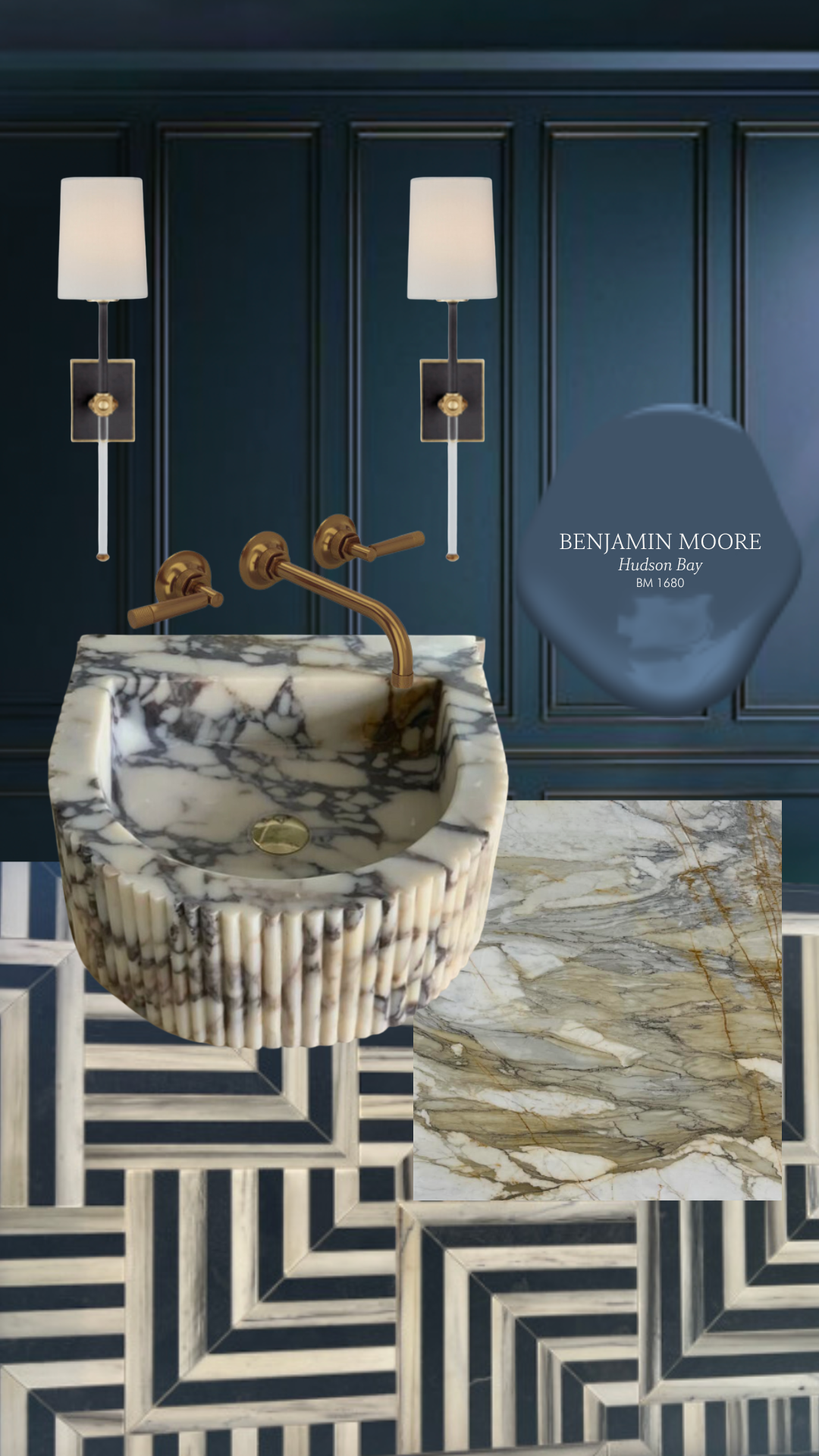
This powder room has graphic tile, complex paneling, and a fluted marble sink... So, of course, we HAD to add a high-gloss paint color to the mix.
Benjamin Moore—Hudson Bay is saturated and moody, and it beautifully complements the marble vanity and sink. The high-gloss sheen elevates the glam level in this space and will make it feel super luxe and unique.
Guest Bath #1
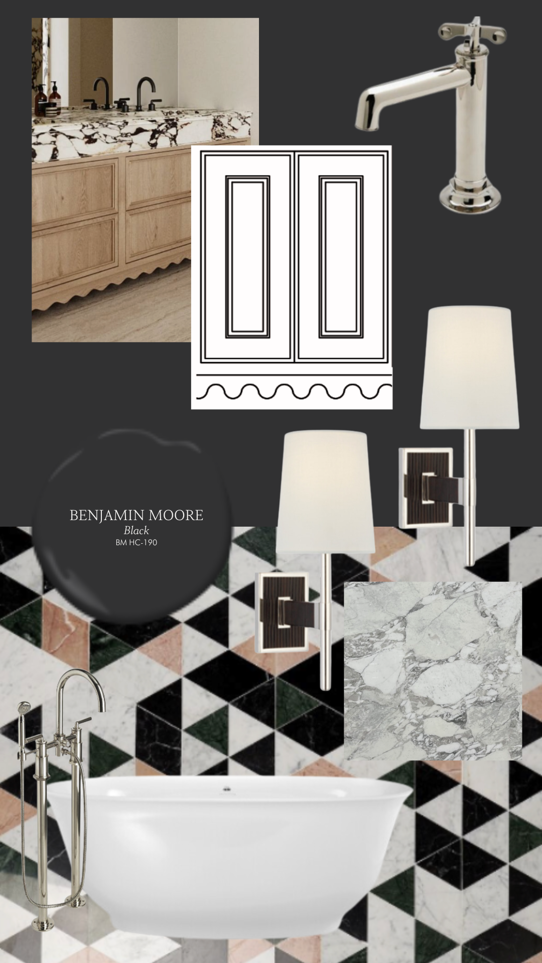
This guest suite bathroom is another area where we wanted to incorporate a high-gloss color. These vanity cabinets, with the CUTEST scalloped toe kick profile, will be painted in Benjamin Moore - Black. It doesn't get more classic than this dark, anchoring neutral.
This high-gloss color keeps the space feeling luxe and sophisticated but lets the Prism Rosa tile have its shining moment.
