Fresh Take On French: The Nursery
May 17, 2023
As interior designers, we've worked on every room imaginable, but we must say baby nurseries hold a particular joy. Nurseries are a space where we get to incorporate lots of playful and youthful design elements - which makes them super fun and different to work with.
From the beginning of the design process, we envisioned a whimsical, visually stimulating, and playful space that still felt like a calming sanctuary.
And we just loveeee how this space turned out.
Pattern Play
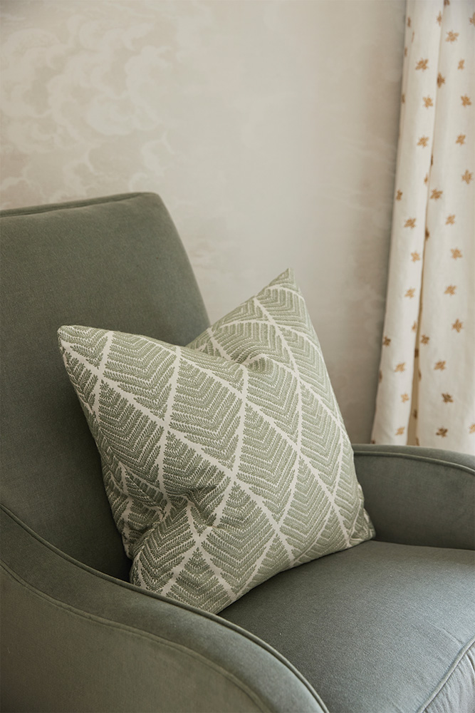
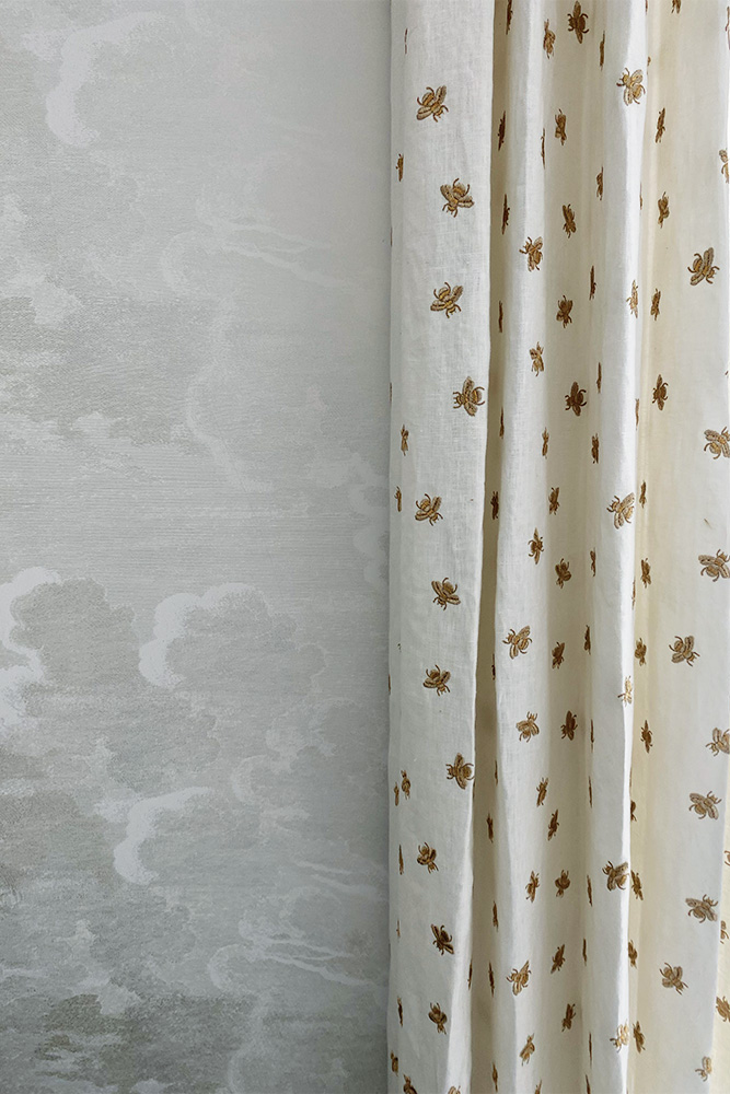
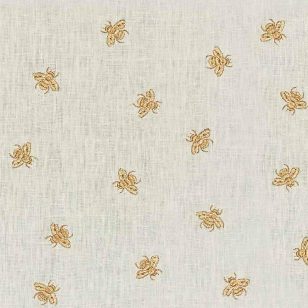
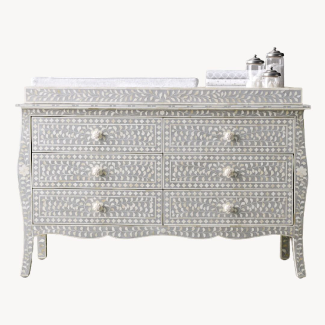
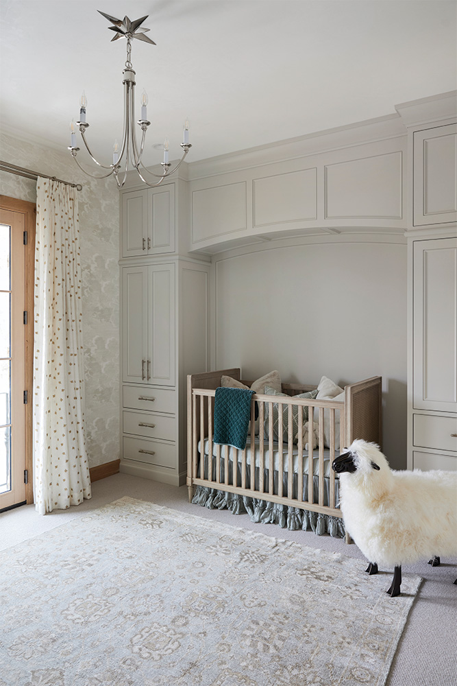
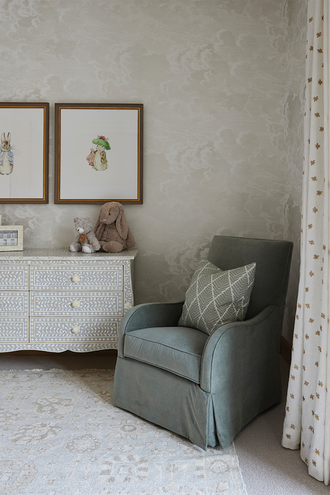
We incorporated tons of playful patterns in this space. From the cloud wallpaper to the embroidered bee drapery to the rug, dresser, and pillows - there are so many motifs to explore.
Even though these patterns all contribute to tons of visual stimulation for the littles, we didn't want the energy of the space to feel too frenzied. Nurseries are meant to be sanctuaries. While there are lots of prints and patterns in this space, we kept the color palette more muted. Everything is in an earthy neutral tone or in a calming sage green - to help maintain a soothing environment.
A Space That Can Grow With Your Littles
The thing about babies is that they don't stay babies forever! So nurseries need to be able to adapt and grow as well!
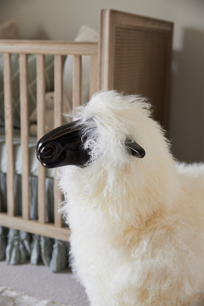
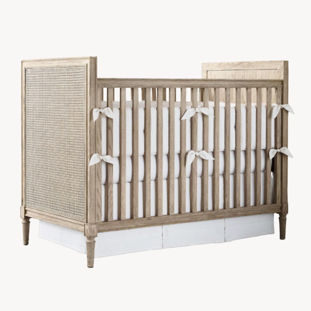
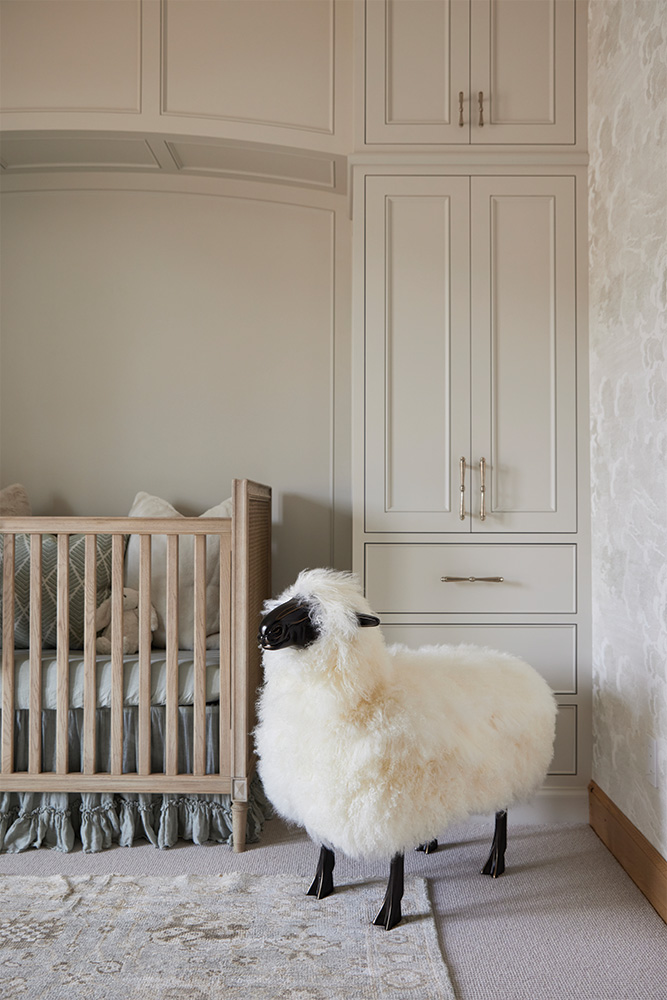
Because this project was a remodel, this particular bedroom had no closet space. Which meant we had to come up with some creative storage solutions. The custom-built storage cabinets provide ample storage space for a growing child's wardrobe and belongings. We love the arched alcove that frames the crib because it's such a charming detail and makes the area feel really custom; plus, when the crib is ready to be retired, the nook can fit up to a queen-sized bed!
The Nursery Bathroom
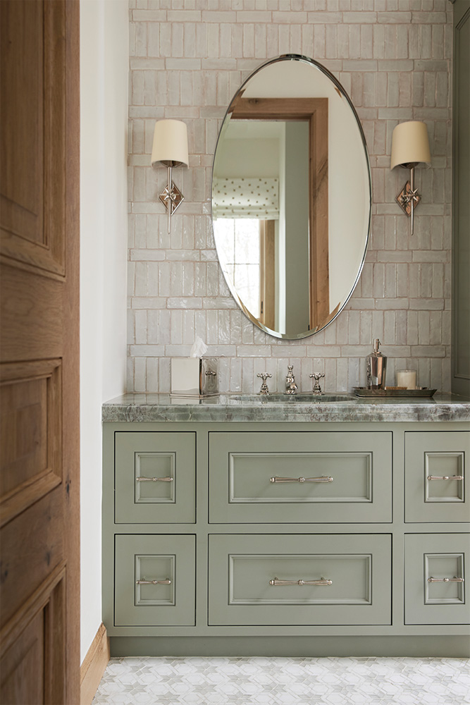
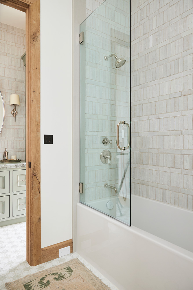
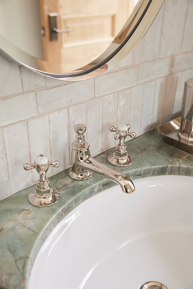
We have a tiny obsession with statement stone at the moment... And the second we laid our eyes on this Aqua Quartzite slab, we fell head-over-heels. The green stone was the main driving force behind the serene color palette for the nursery because we wanted the two spaces to meld into one another and feel cohesive.
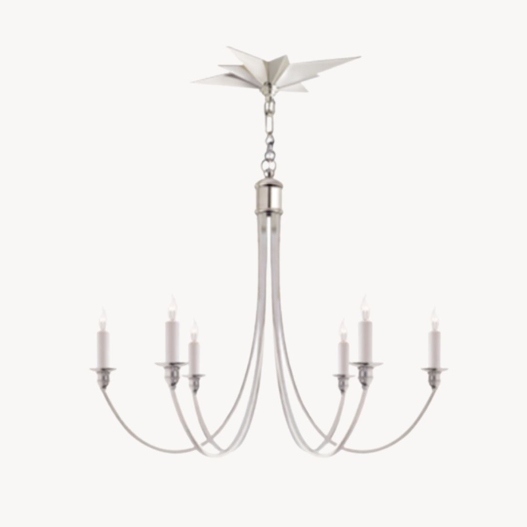
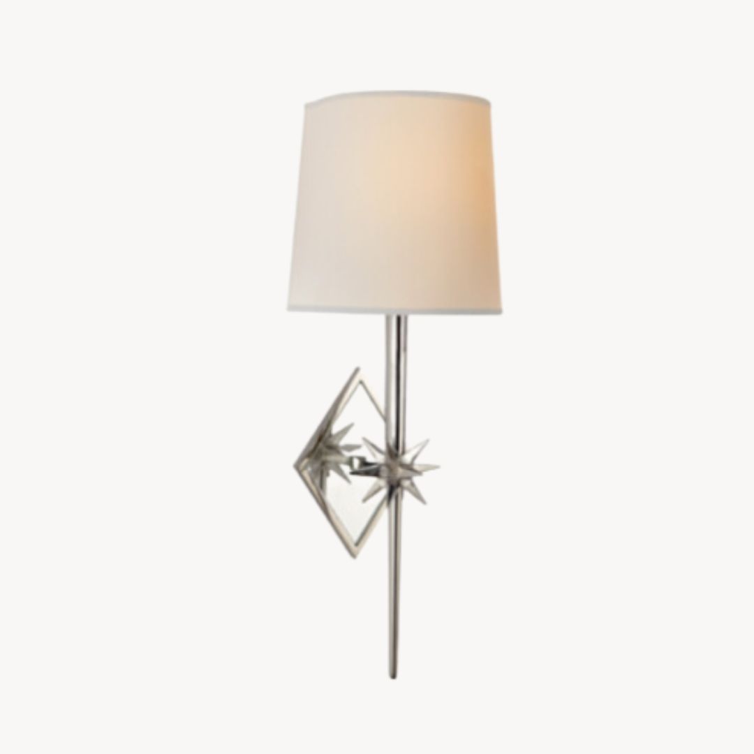
We love how the star detail on the sconces and in the floor tile echoes the theme of the chandelier in the nursery. It's a charming detail that looks beautiful and creates further cohesion between the two spaces.
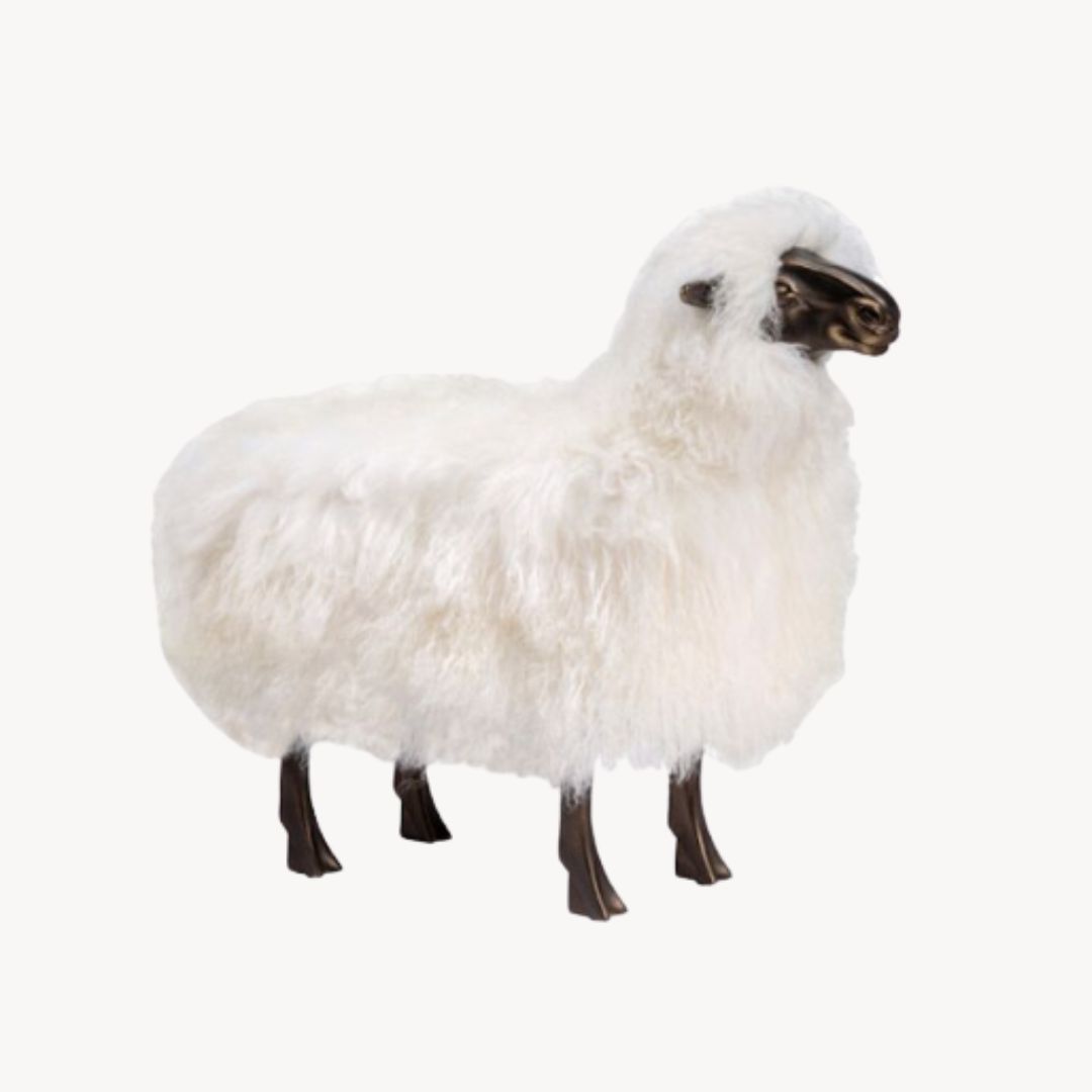
Shop Nursery Details
Here we've compiled some of the nursery details for you to shop! Click on each photo to open up a shoppable link.
As always, if we've missed something you're interested in, feel free to leave a comment below or reach out to us on Instagram, and we will be happy to share!
#cooldesignersdontgatekeep
