Fresh Take On French: The Office
May 22, 2023
Hello, and happy Monday! We’re kicking the week off today with a photo tour of the Fresh Take On French office. We worked with Magelby Construction and Intrigue Window Fashions on this room to achieve this dark, moody, and tonal dream office space, and we couldn’t be more excited to show you around!
Dark + Moody
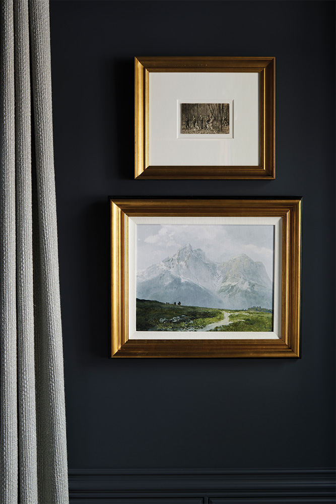
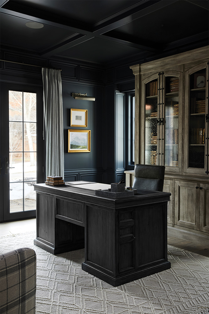
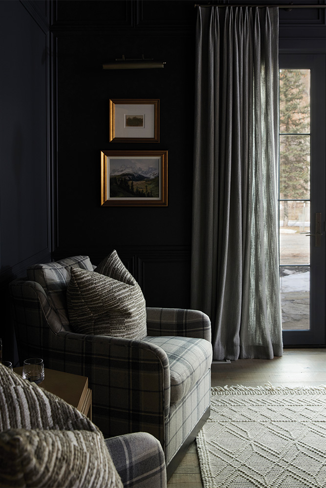
We knew we wanted a dark, moody look when we started designing this office, so we decided to go all in. We didn't just want to make the walls dark; we wanted to whole space to be dark. We used Ambler Slate, by Benjamin Moore, not only on the walls but on the ceiling, trim, windows, and doors. Basically everything.
Molding details and trim work are easily one of the best ways to elevate the feeling of your home. We've incorporated lots of trim work throughout the rest of the house, so it felt natural to carry the theme into this space as well. We worked with Magelby Construction to do this stepped trim detail and the coffered ceiling detail to make the room feel custom and luxurious.
Often people think if they do dark walls, they need to do light furniture, but we don't think that that's necessarily the case; in some spaces, it adds to the room to do that dark-on-dark layering.
Menswear Textiles
Along with the dark, moody vibe - we also wanted this space to feel masculine and sophisticated. Our favorite way to do this is to incorporate classic menswear textiles.
We had these custom plaid swivel chairs made for the space, and we love how cozy and refined they turned out. The chairs also create a nice conversation space for the room.
The Book Shelves
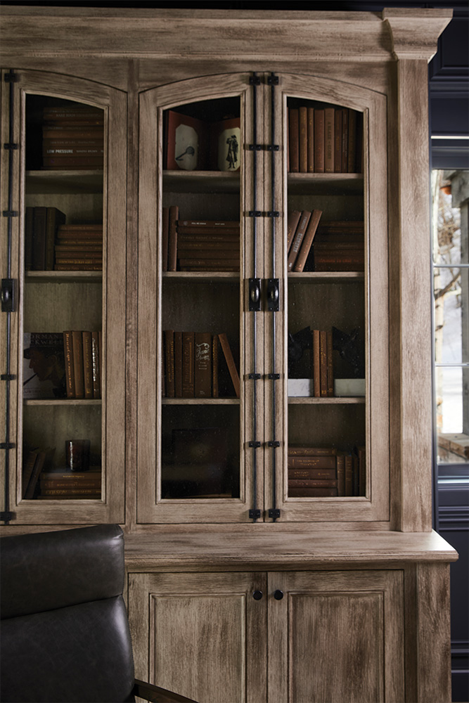
We had our cabinetry team fabricate this insanely gorgeous bookcase. The piece was built into this space - but stands proud of the wall to look like its own piece. The seeded glass doors perfectly display collected treasures and personal memoirs - which, in our opinion, is a necessary detail for any home office.
We love the old-world, French look of the custom iron cremone bolts because they add so much character to the piece itself and the entire space.
The Bathroom
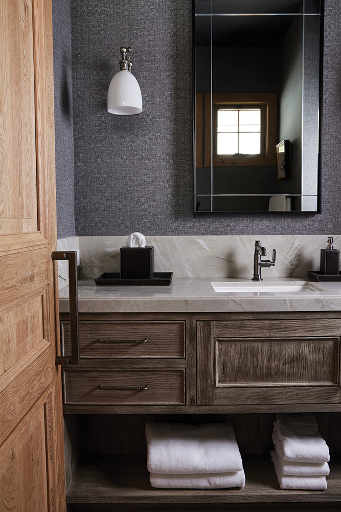
You probably can't tell from this photo, but the wallpaper in this office bathroom is actually an itty bitty herringbone pattern - another way we incorporated menswear textiles into the space. The wallpaper is Vinyl Herringbone in Galway Grey from Phillip Jeffries. We like using vinyl wallcoverings in bathrooms because it is super durable in high-moisture or humid spaces.
We love how the Bianca Superiore Quartzite counters brighten up the space just a tad - but have enough of a warm gray undertone to prevent the stone from looking too stark white in the area.
We loveeee how this office turned out. This week we are also sharing photo tours of the guest bedrooms and the bunk room! So stay tuned!
