The Bond Design Studio: Photo Tour
March 1, 2023
Hello! From here in the new Bond Design Studio (aka our little Park City barn loft we’ve named “The Office Ranch”), where the elk, highland cows, and bunnies roam. If you've been following us on Instagram, you know we recently moved into our new studio. We are so excited to finally bring you inside our home away from home, so without further adieu, let's take a tour!
The Entry
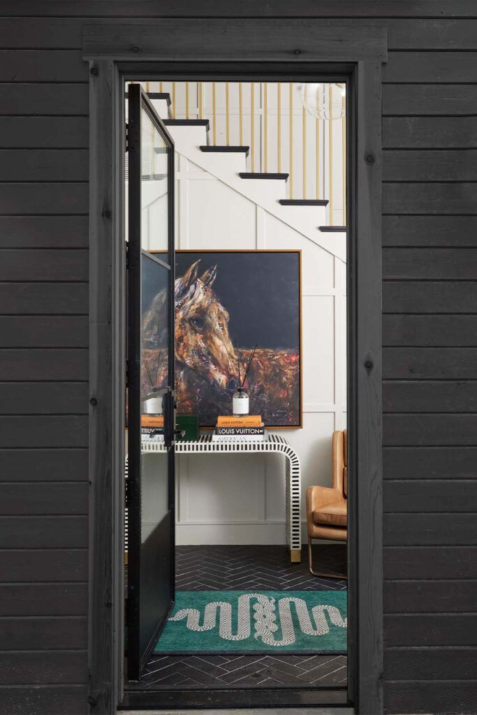
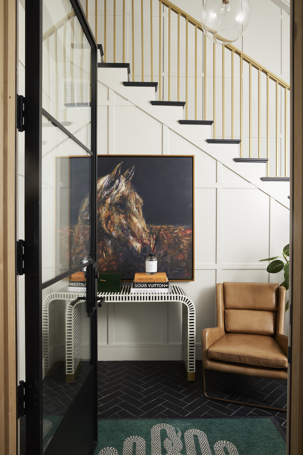
Since our studio is located above a barn (It's a little unconventional, we know, but we absolutely adore it!), our entryway is actually a stairway. The space is a little atypical for a business entrance, but we didn't want our studio to feel like a boring office space anyways. So, we leaned into the unusual layout and made our entry feel as inviting, comfortable, and homey as possible.
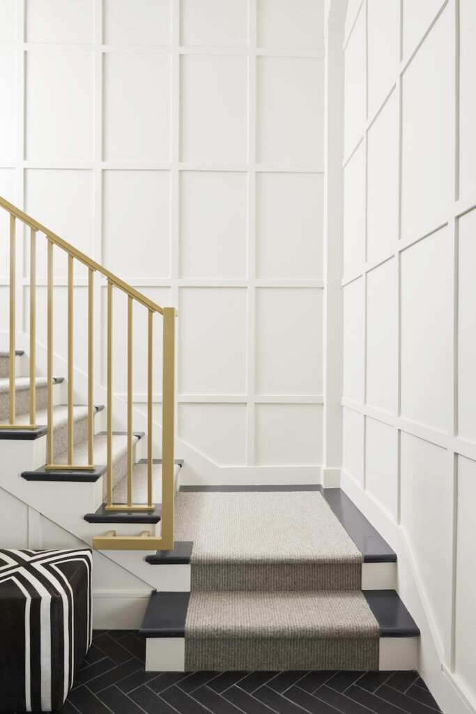
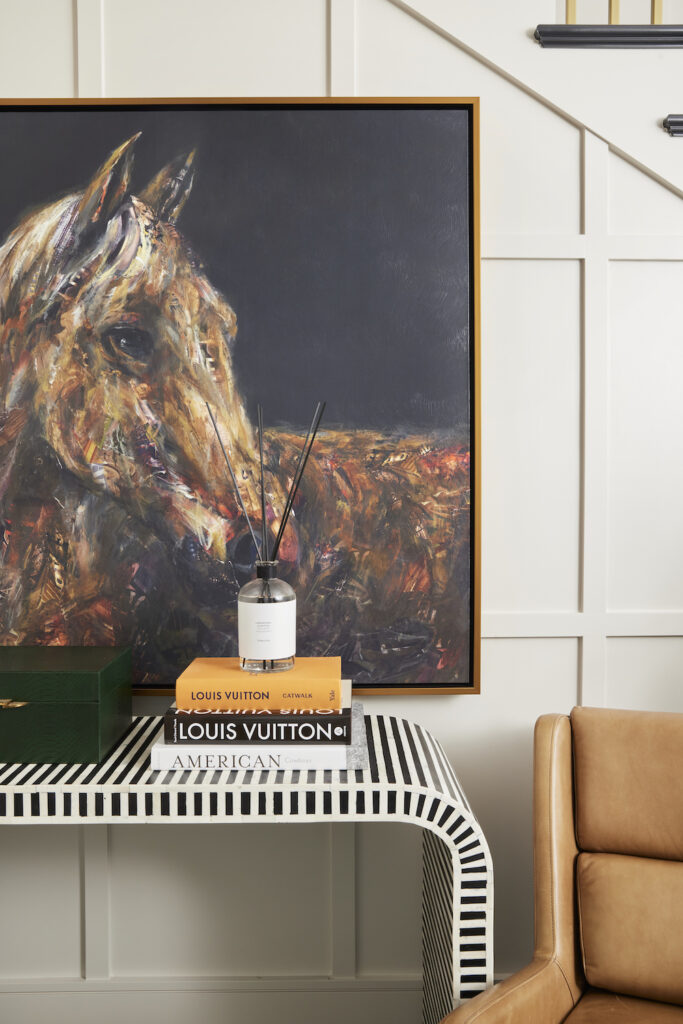
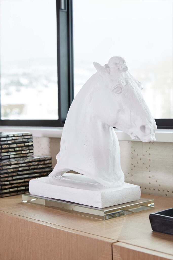
Upon entering, one of the first things to catch your eye is the art - a necessary tribute to the horses on the property and the stables below the studio. The stairway is clad in wall-to-wall, floor-to-ceiling paneling to fill the large space and add some dimension. For just a touch of glam, we selected a powder-coated brass railing.
The Lounge
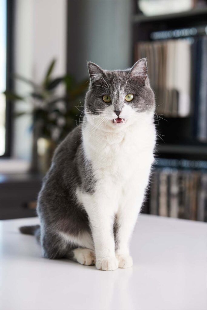
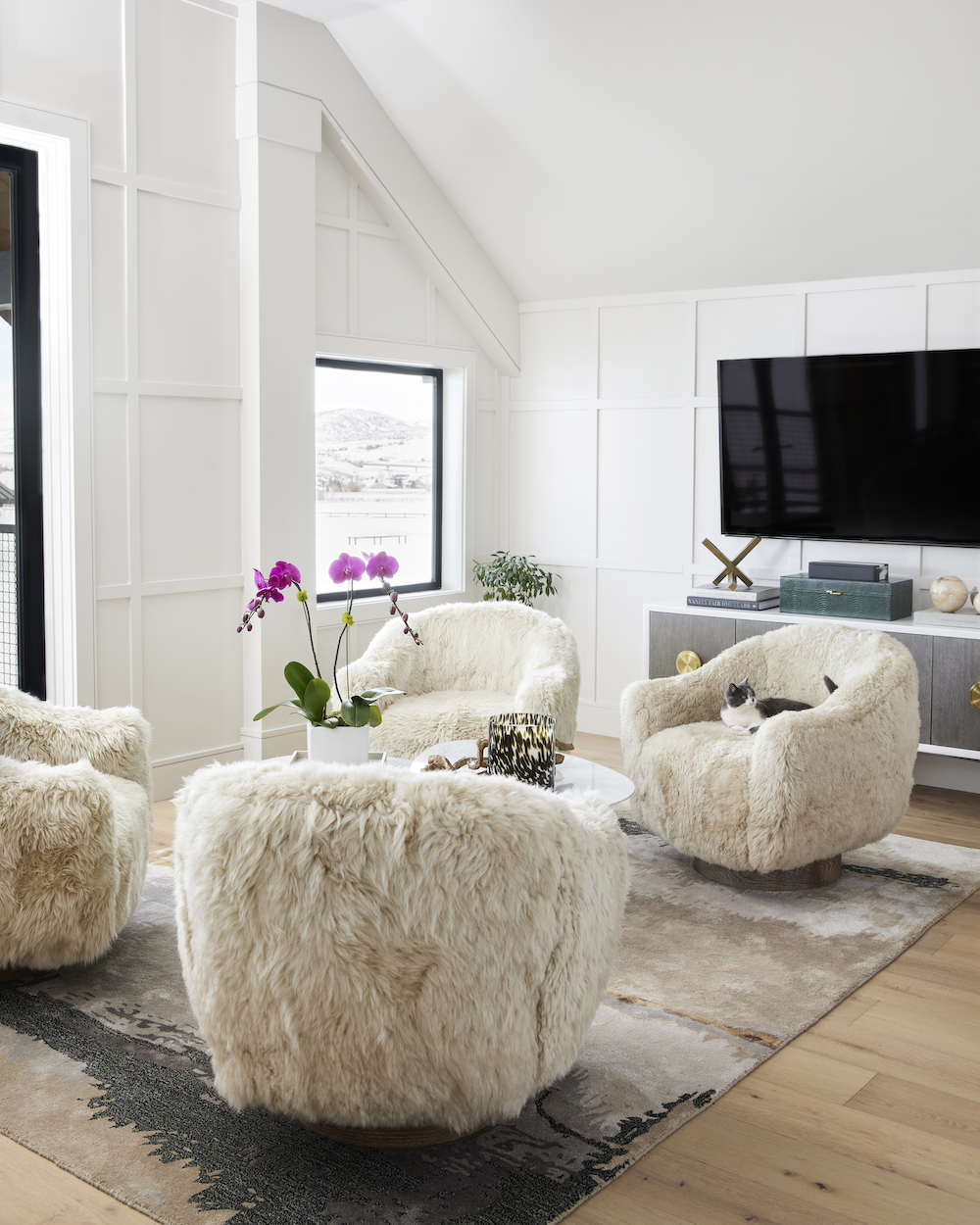
The paneling in the stairway entry carries into the lounge space to create a seamless transition between the two areas. We mostly use this flex space as a breakout area for team meetings or private work, and Perla has understandably claimed the room as her favorite nap spot. I mean, who could resist those plush swivel chairs?
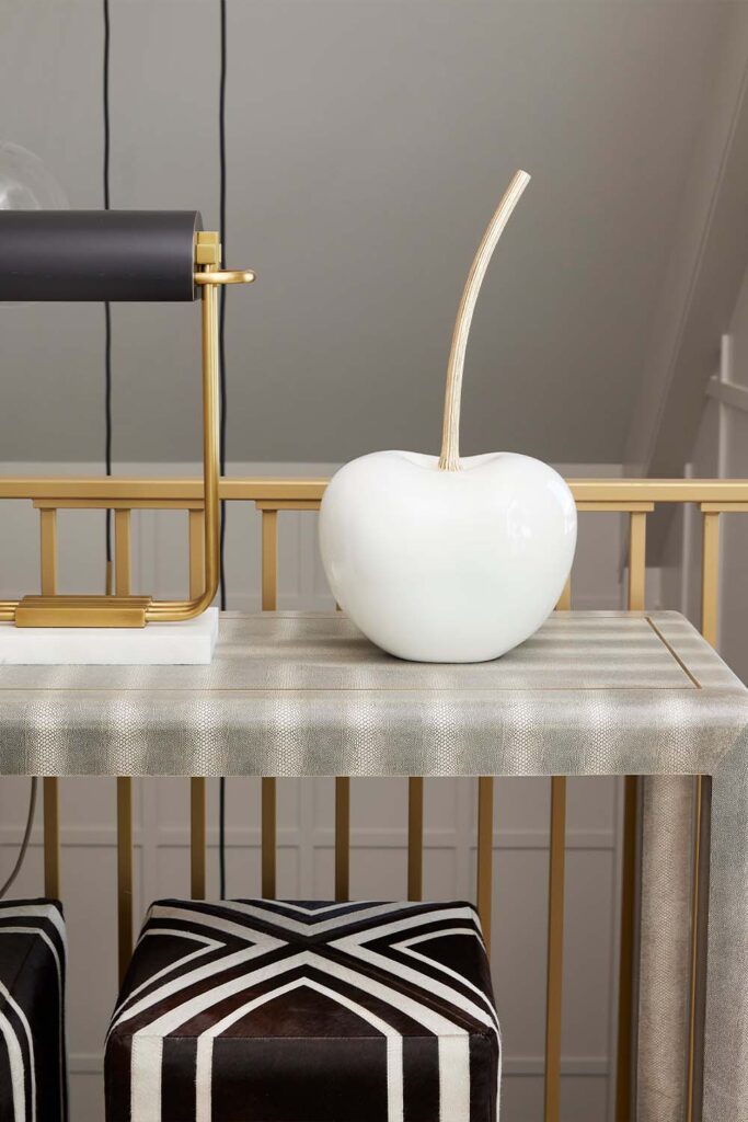
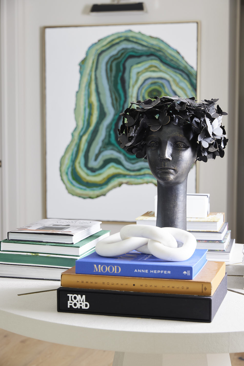
To style the space, we added some fun accessories and art. We are obsessed with our Arteriors cherry sculpture and love the quirky personality it adds. The beautiful green painting, commissioned by our crazy talented friend, Jordan Daines, is reminiscent of the cross-section of a tree trunk. We love the modern pop of color, texture, and pattern the piece brings to the space.
The Kitchen
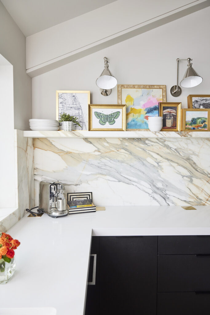
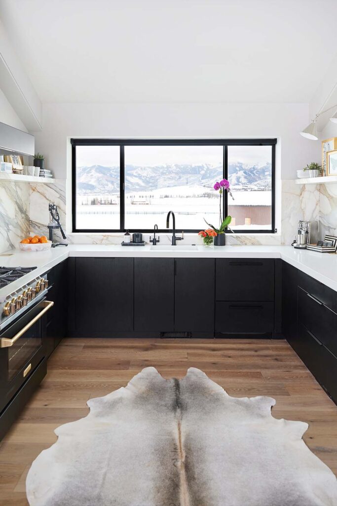
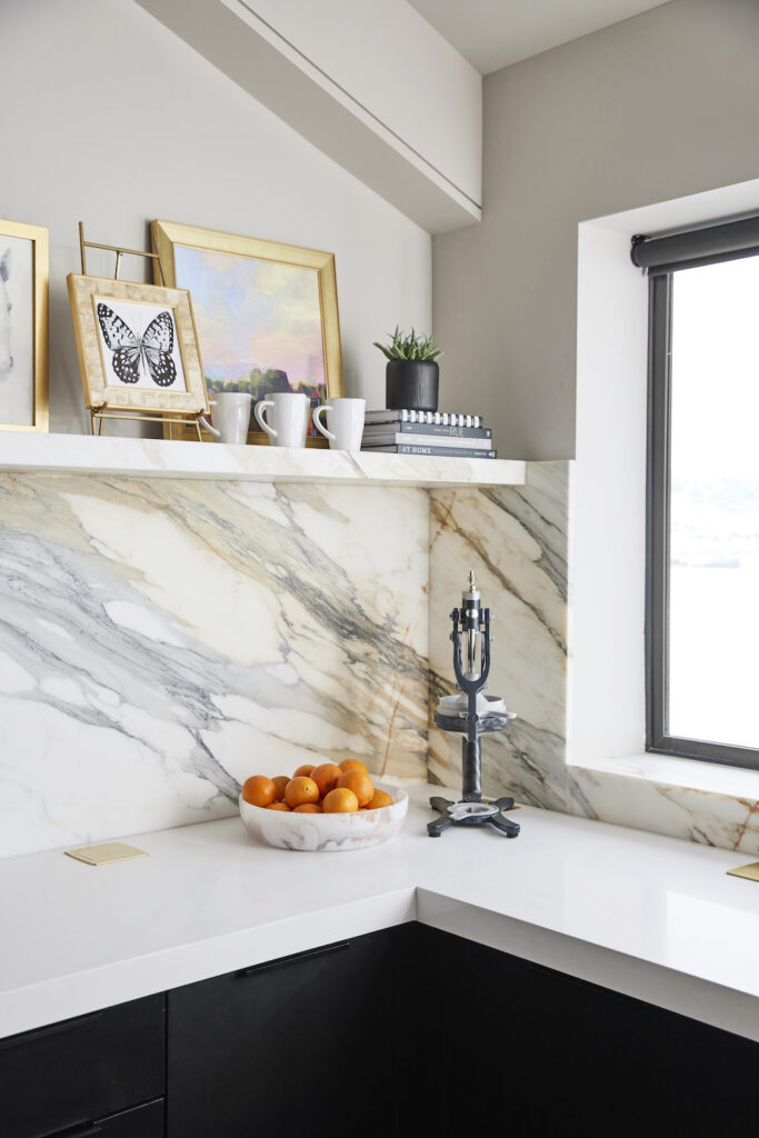
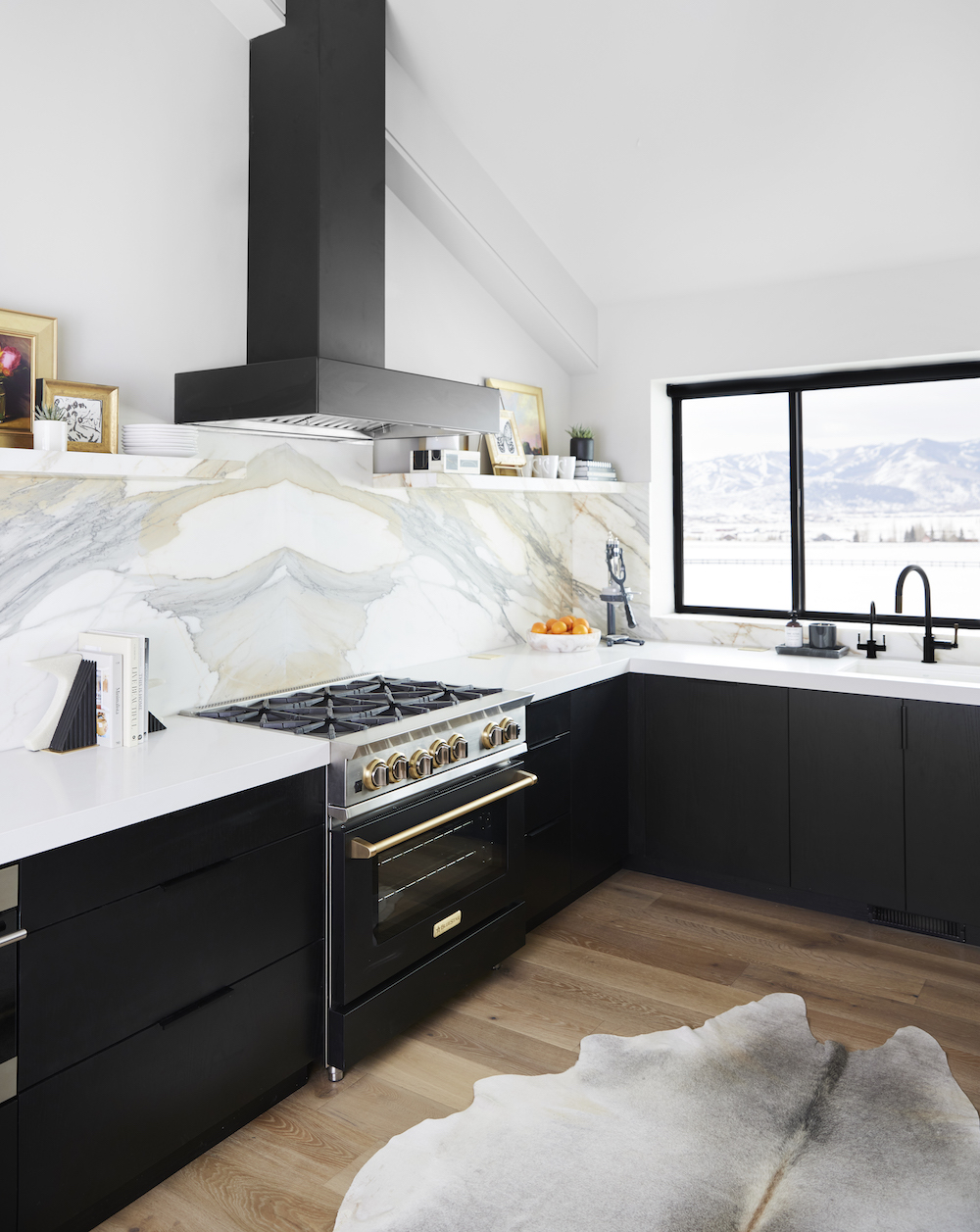
The driving force behind the design of our kitchen was the Calcutta Macchia Vecchia slab we sourced early in the design process. We fell in love with it and couldn't stay away! The dramatic marble begins on the wall and then wraps itself into a shelf.
We styled the shelves using an elected mix of art, books, decorative boxes, stoneware dishes, and plants. Don’t be afraid to mix objects of different materials, styles, and eras! The contradictions are actually the key to creating an eye-catching and exciting space.
The Conference Room
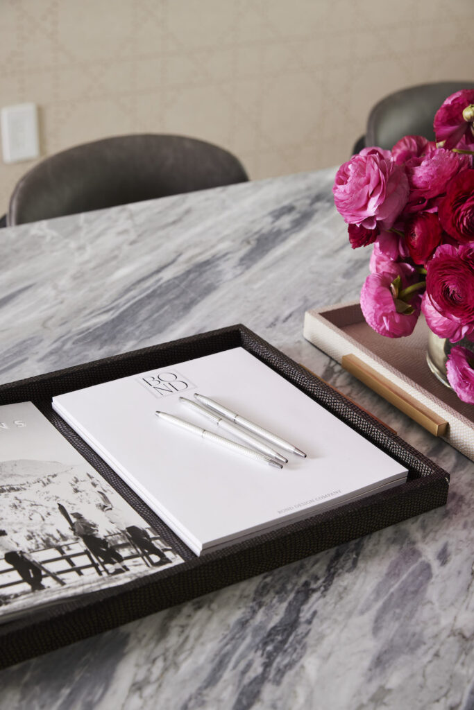
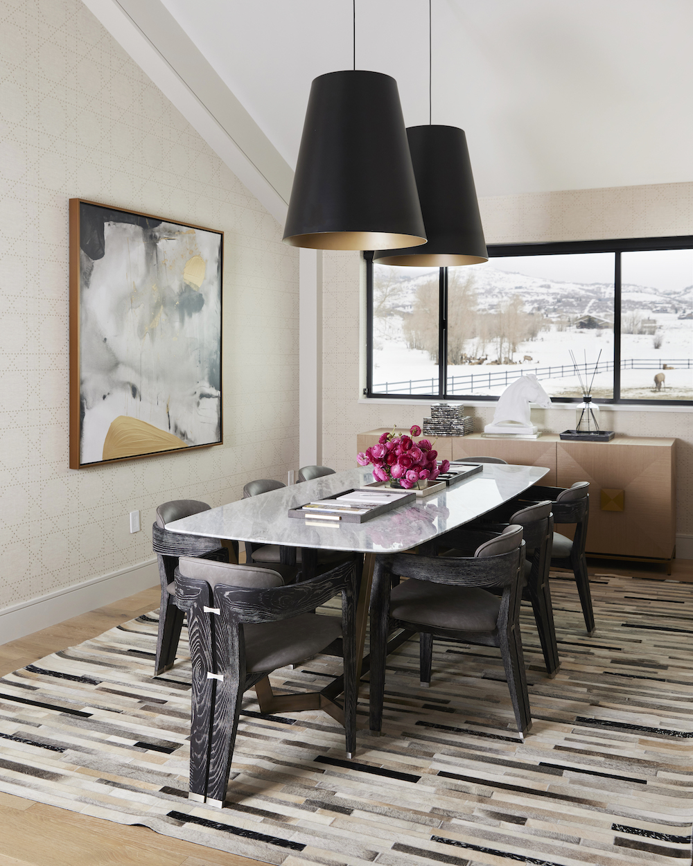
The conference room is arguably the most used space in our studio. Aside from client and team meetings, we use this room regularly as a collaborative workspace.
To visually distinguish the space in the open-layout floor plan, we covered its three walls with Phillip Jeffries Styled In Studs specialty wallpaper. We love the scale of these Gunnar Pendants and how the interior is highlighted in a beautiful semi-gloss gold - further incorporating the metallic hues throughout the studio.
The Design Library
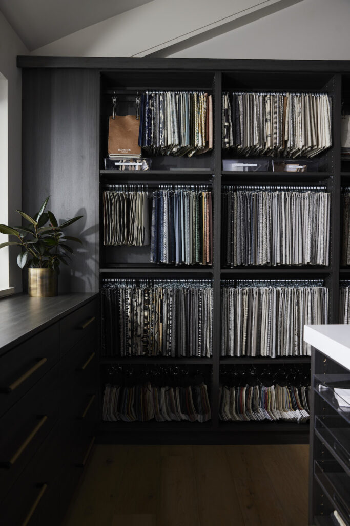
After many, many, years in the design industry, our designers had strong opinions about the layout and functionality of our library.
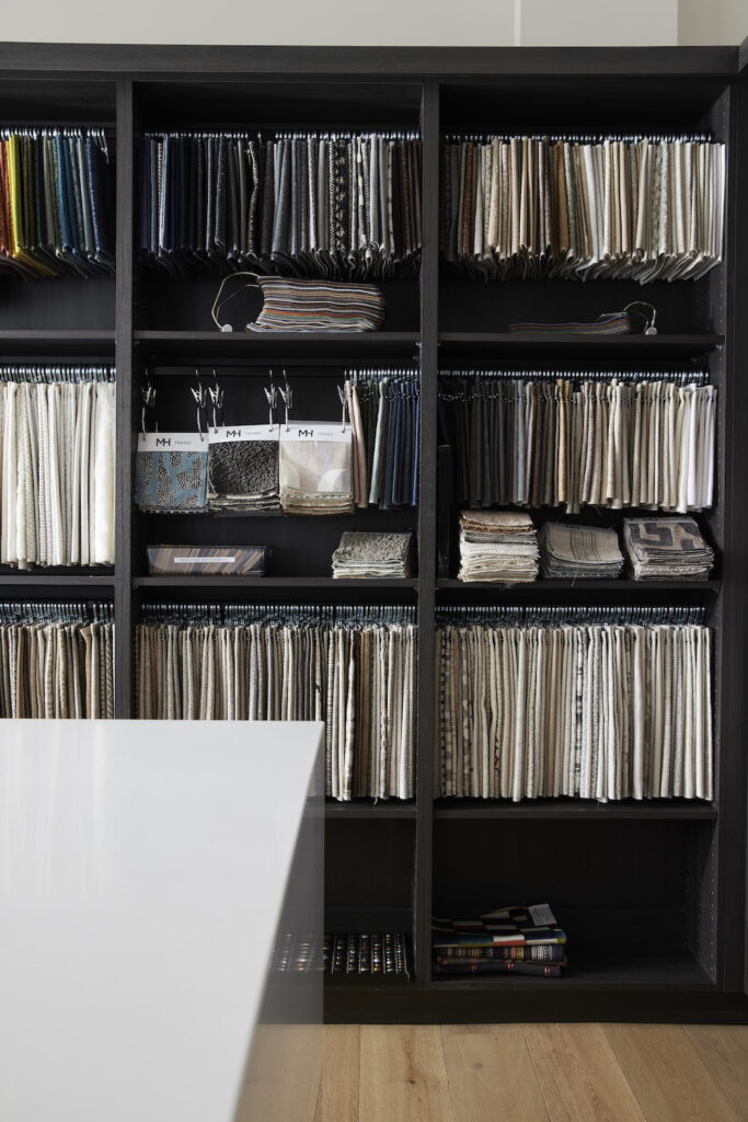
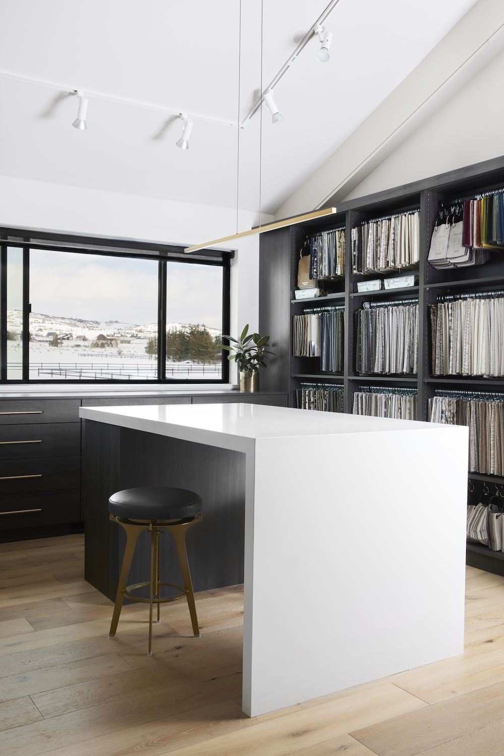
To accommodate our ever-growing, ever-evolving collection of design samples, we worked with Utah Closet Connection to create a fully customizable shelving system. Each shelf and hanging rack can be repositioned to fit different fabric lengths and sizes.
The library is divided down the center by custom shelves and bulletin boards to create two separate work areas. This way, more than one designer can privately use the room at once.
The Breakout Office
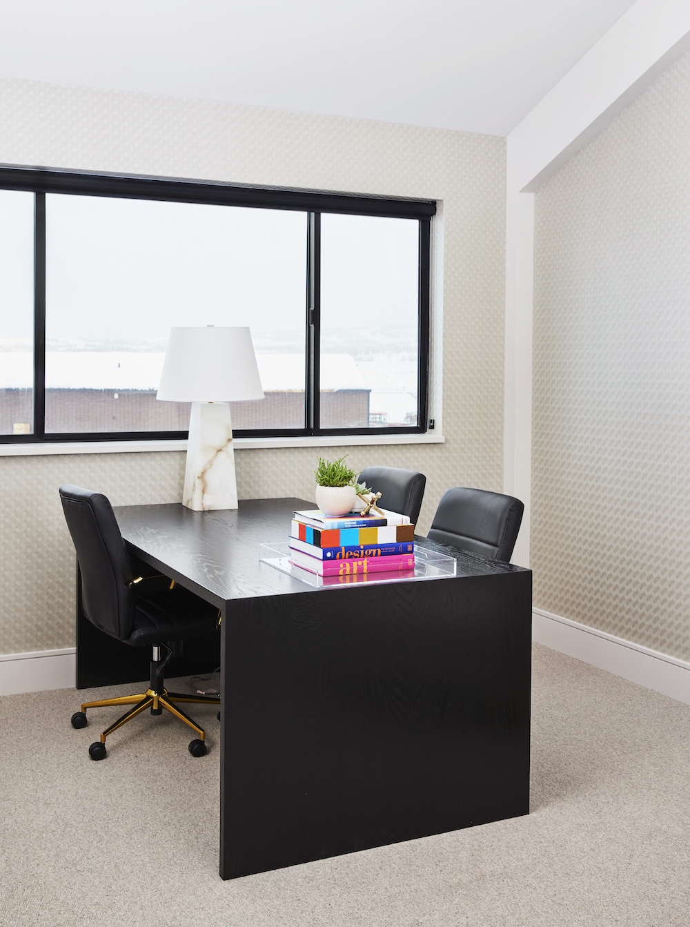
A main goal for our studio was to have areas for both individual work as well as ones for collaboration. The breakout office helps us do just that — on any busy day, you’ll find it filled with team meetings and designers taking zoom calls.
We're filling this room with some colorful artwork to add a fun personality to the space. Unfortunately, the piece we ordered didn't arrive in time to photograph, but we still love this space nonetheless.
The Workroom
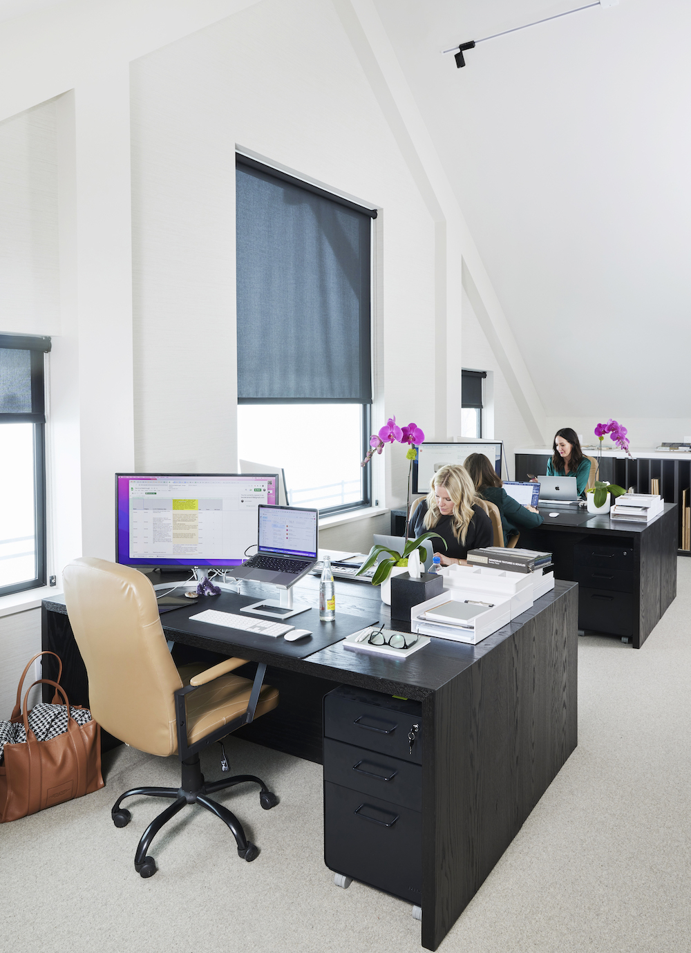
Our design team works mostly from the collaborative designer workroom. Before rennovation, the space was originally two separate rooms. We removed the dividing wall to create one large space and added the massive center window to let in more natural light.
On both ends of the room, we fabricated custom cupboards to organize our flooring samples and project bins.
The Powder Room
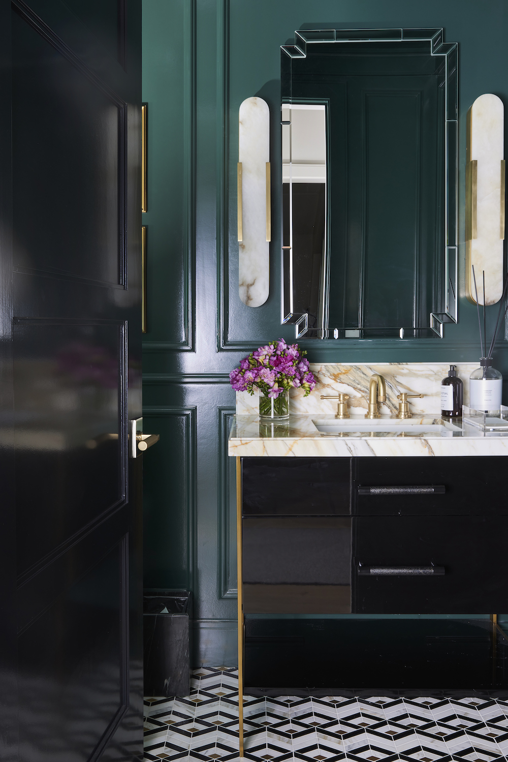
Powder bathrooms are admittedly one of our favorite rooms to design. They are perfect for trying out new styles, and the smaller space makes bold design choices even more effective. We wanted our powder room to feel moody and modern with a touch of glam. To achieve this look, we used a high-gloss paint, Benjamin Moore Goodwin Green, and paired it with a geometric tile that has bits of brass to tie into the faucet and sconces.
The details in this bathroom are what make the space. From the wall paneling to the beveled edge on the backsplash and countertop, we wanted this design to leave a lasting impression.
