Whimsical Wallpaper and Dreamy Hues: The Palette of Modern Meadow Remodel
March 24, 2025
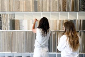
When it comes to transforming a house into a home, few things speak louder than color and pattern. In our Modern Meadow Remodel, we used a mix of timeless paints and playful wallpapers to infuse every room with personality—from crisp, clean neutrals to bold florals and rich, moody hues. Each choice was intentional, layered, and tailored to the family who lives here. Join us as we walk through the palette that brought this home to life—whimsical, grounded, and just the right amount of unexpected.
White Dove - Benjamin Moore
Even in a home filled with bold wallpapers and decorative ceiling details, you still need a dependable neutral to ground it all—and for us, that’s White Dove by Benjamin Moore. It’s one of our forever favorites: light and bright without feeling cold, thanks to its soft, creamy undertones. We used it throughout the main spaces on baseboards and any white-painted walls to create balance and cohesion. It’s the kind of color that plays well with others and quietly makes the whole house feel pulled together.


Belladonna - Zak + Fox
The powder bathroom is where we let modern edge and playful pattern collide. With its sleek graphite marble countertops, streamlined faucet, and custom vanity, this space leans contemporary—but we wanted to soften it with a touch of charm. Belladonna by Zak + Fox struck the perfect balance. Its whimsical floral motif has just enough structure to complement the clean lines, while the unexpected palette adds a little intrigue. It also sets the tone for the floral story woven throughout the rest of the home—because nothing says thoughtful design like a theme that carries room to room.
Inchyra Blue - Farrow & Ball
If there’s one thing we’ll always say yes to, it’s a good color-drench. This home office-slash-library was begging for drama, and Inchyra Blue by Farrow & Ball delivered. We pulled the paint color straight from our client’s beloved blue velvet sofa, wrapping the walls, trim, and ceiling in the same rich hue for a fully immersive vibe. Depending on the light, it shifts between slate blue, stormy grey, and a deep green—basically, the moody chameleon of paint colors. It’s modern, a little mysterious, and brings just the right amount of quirky charm to a space meant for both focus and daydreaming.


Rubia - Schumacher
Remember how we said we love carrying a theme throughout a home? This guest bedroom is a perfect example. On the lower level, each guest suite features a floral wallpaper—each one totally unique, yet all working together to create a cohesive, intentional feel. For this first room, we went with Rubia by Schumacher. Its soft golden motif brings just the right amount of pattern, adding warmth and interest without stealing the show. It’s a quiet kind of floral—one that plays nicely with the layered prints and drapery, proving that wallpaper doesn’t have to be loud to make a statement.

Chrysanthemum - Schumacher
In the next guest bedroom, we took the floral theme and gave it a dramatic, monochromatic twist. Chrysanthemum by Schumacher brings bold pattern in a carbon colorway, proving you don’t need bright colors to make a statement. This guest suite dials the pattern up to 100 and the color down to zero—and we’re obsessed with the result. While the motif still nods to the floral thread carried throughout the home, the vibe here is totally its own: tailored, graphic, and quietly powerful. It’s proof that personality can come through in the palette and the pattern.


Canopy - Schumacher
In the bunk room, we turned the whimsy all the way up. While many clients prefer a neutral palette for versatility, this space was designed just for the grandkids—and that meant we had full permission to go bold, playful, and totally delightful. Canopy by Schumacher, with its garden-inspired motif and punchy color palette, was the perfect fit. It brings a sense of wonder and storybook charm to the room, making it feel like a world all its own. We loved it so much, we carried it onto the pillows and window shade using the matching fabric—because when you find a wallpaper this good, you double down.


Knoxville Gray - Benjamin Moore
The bunk room wallpaper brought so much joy, we couldn’t just stop there. In the adjoining bunk bath, we carried the color story through by painting the vanity Knoxville Gray by Benjamin Moore. Don’t let the name fool you—this hue is less gray and more of a moody blue-green chameleon that shifts beautifully with the light. It complements the playful wallpaper perfectly while adding its own dose of personality. In a space made for little adventurers, it felt right to lean into color and create something just as fun as the room next door.


Calais - Rose Tarlow & Rainy Afternoon - Benjamin Moore
Our last floral wallpaper (how are there so many and yet still not enough?) is Calais by Rose Tarlow—and she’s a tiny but mighty gem. This darling, delicate print found its home on the snack bar walls in the lower-level family room, adding just the right amount of personality to an otherwise bare corner. It’s subtle, sweet, and the perfect backdrop for open shelves filled with quirky accessories and colorful snacks. We paired it with Rainy Afternoon by Benjamin Moore on the cabinetry—a deep green grounded by soft gray undertones—for a look that feels equal parts whimsical, modern, and effortlessly cool.
From bold botanicals to barely-there florals, this home is a love letter to wallpaper and paint—how they can shape a space, tell a story, and bring personality into every corner. At Modern Meadow, we didn’t shy away from color or pattern—we leaned in, layered up, and had a lot of fun along the way. Want to see how it all comes together? Watch the full home tour on YouTube and step inside every room for yourself. Trust us, the details are even better in motion.