The Paint Palette: Laurel Creek
October 31, 2025
Laurel Creek has become one of those homes where color quietly steals the show... and by far, our most asked question has been: "What paint color is that?!" Every shade was selected for a reason, to enhance the light, play up the architecture, and bring out the beauty in each material choice.
So we put together this all in one reference. A complete guide to the Laurel Creek paint palette, with notes on how these colors behave, where they shine, and how you might use them in your own home.
Bookmark it, screenshot it, bring it to your painter. It is a good one to keep close.
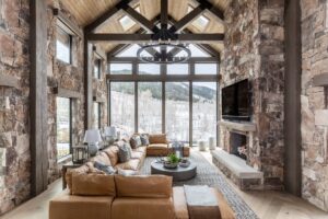
A Soft & Airy Chameleon
This was one of the first paint colors we selected for the home, and it has remained our favorite throughout the entire process. Gray Wisp can read like a gentle gray in the morning, a breezy blue at midday, and a calm green right before sunset. It has subtle personality, just enough color to feel fresh but not so much that it overwhelms the art and furnishings. It feels timeless, somewhat vintage, but still fresh at the same time. Don't be afraid to color drench with this gorgeous shade.


The Perfect Cozy Neutral
Warm, creamy, and incredibly versatile. Classic Gray leans toward a soft greige that wraps a room in comfort. In high light rooms it feels bright and velvety. In lower light, it leans cozier and richer. We used it to frame the de Gournay wallpaper in the primary bedroom because it never fights with pattern. It lets art and texture stand front and center while still giving the room a layered look.
We used this color in both the bedroom and the bathroom to bring continuity to the space.


Quietly Dramatic
Pigeon is a smoky blue gray with gentle green undertones that feel instantly timeless. Its depth shifts beautifully with the light and brings just the right amount of drama into a smaller space. We originally selected this shade because it coordinated perfectly with the Acquaviva quartzite. But once we saw it in place, we fell in love with how it elevated the entire room. That is when we made the decision to color drench the butler’s pantry so the stone and paint could work together in complete harmony. It feels custom, cohesive, and undeniably rich.


Warmth Where It's Needed Most
A warm neutral that feels inviting rather than builder basic. Natural Cream leans creamy in warm light and softer in cool light. It is a wonderful solution for spaces where tile and appliances tend to make things feel cold. In the laundry room, it brings comfort back to a very utilitarian space. Practical does not have to feel sterile.


Tailored Trim With A Twist
You might be asking, "Wait, this room is wallpapered." Ah, yes, but the trim is not. Water’s Edge is that rare blue that feels both sharp and inviting. It sits between steel blue and dusty teal, adding depth without overwhelming the room. We initially imagined a darker trim to ground the space, but once we noticed the quiet hints of blue woven into the wallpaper, the decision was obvious. Pulling that tone forward created a tailored and masculine look with just enough surprise to feel curated rather than expected.


Earthy & Calm
A grounded sage green with a peaceful, lived in feel. Saybrook Sage plays beautifully with creamy whites, floral patterns, and natural textures. We used it on the trim in this guest bedroom, and it adds character without overwhelming the wallpaper. Bedrooms deserve colors that feel restful, and this one delivers on that promise.

Compliment, Not Contrast
We originally considered going bold with a pink trim in this room, pulling a standout tone from the wallpaper. But once the space began to take shape, we realized the other design elements deserved the spotlight. Enter Beach Glass. This soft blue green feels fresh and calming, complementing the wallpaper rather than contrasting with it. It adds just enough color to create dimension while still letting the room feel serene and balanced. A quiet supporting role that elevates everything around it.


Cool & Crisp
A slate leaning blue gray that feels crisp and intentional. Grey Matters works especially well with marble because the cool undertone pulls the veining forward without overwhelming it. On bathroom cabinetry, it offers contrast that stays light enough for smaller spaces.


A Bold WFH Moment
A deep, refined forest green that absorbs light in the most beautiful way. Jack Pine is saturated but not loud, elevated but still playful. Used in the office, it connects the ceiling wallpaper to the space for a full color story that feels moody but elegant.


Every shade in Laurel Creek was chosen with harmony in mind. Nothing is fighting for the spotlight. Everything builds toward a quiet and luxurious cohesion.
Color is one of the most accessible and joyful tools in design. A gallon of paint can transform a room more than nearly anything else. We hope this palette helps you feel confident making that leap in your own home.
Want to see the rest of the home? Watch the full house tour on YouTube!